Harmony of colors. Color harmony palette. Harmony of color in the composition Harmony of overall color tone and lightness
As you know, all the colors that we see can be divided into achromatic (white, black, shades of gray - no color waves, only lighting.) and chromatic (the colors of the spectrum, the color waves that our eye perceives). Color waves smoothly transition into each other, creating color continuum- continuous smooth color change.
These two directions do not exist separately, chromatic colors (the entire continuum) are mixed with achromatic colors, which gives the whole range of shades
that our eye sees. The whole range is most successfully presented in the three-dimensional "Tree" by Munsell. 
Impurities of different achromatic colors form different tone directions.
If you mix pure color with white, you get bright colors, with black - dark.
If we talk about color as about color waves, then gray is a mixture of a color with its opposite (ie, for example, orange and blue), two waves "extinguish" each other and the color saturation is lost. Therefore, soft colors (mixed with gray pigment, with the opposite wave, in fact) look "complex, nuanced". So, a mixture with gray gives " soft
colors". 
If we talk about artistic color harmony, then not all chromatic colors of the continuum look good with each other, they are combined with a certain rhythm. Colors with a golden undertone are considered warm , colors with blue - cold ... There are also temperature-neutral colors that are in a continuum between two shades.

In total, we have 6 color characteristics, 3 pairs of dichotomies
.
Dichotomy is a scale. It is not so much a choice or - or, as being on this scale. For example, both colors can be warm, but one is pronounced warm, and the other is closer to neutral.
The generally accepted color characteristics are:
Lightness: light
(with white impurity) or dark
(with a black admixture).
Brightness (saturation): bright
(almost pure, saturated pigment) or soft
(mild pigment, close to gray, gray impurity)
Color tone (place of color in the continuum). This includes the division of colors into warm
(with a golden undertone) or cold
(with a blue undertone)

Any color is described by all three characteristics, however, they are expressed with different intensities.... This provides a variety of shades. The characteristic that is most pronounced has the greatest influence on the perception of color, the rest of the characteristics make adjustments. If you combine all the color characteristics, you get 48 options - 48 colors blending into each other
... I have already told you how they transform into each other. This is an absolutely unique author's development, so I think the questions about which system I work will disappear - I work according to MY "Color Harmony" system, built entirely on color theory, due to which it is more accurate than most other color theories, if not everyone. 
All colors of the continuum can be divided into these cells with blurred borders. However, in practical use 48 palettes are a lot, too many colors will be repeated. Therefore, it is best to reduce the number of palettes to 12. Why 12? I'll explain now. As I said, most of all, the leading characteristic, the most pronounced, affects the perception of color and its compatibility with others. This means that we have 6 directions - bright colors, soft, light, dark, warm, cold. In bright colors, first of all, the purity of color is visible, in soft ones - a gray admixture or "complexity" of color, in dark colors - depth, darkness, in light colors - whitening, airiness, in warm ones - gold, warmth, in cold ones - iciness, blueness.
Compare the cold soft flavor and the soft cold flavor. In the first case, blue and cold are striking. in the second - complexity, gray impurity.


The temperature characteristic is also important for us - since it is precisely when the temperature tint does not match that the skin optically reacts with unpleasant effects (yellowing, pallor, redness, colored shadows) - this is optics. The waves overlap each other and give an unnatural color.
Therefore, those areas where the temperature characteristic is not the first should be divided into two more subgroups.
The result is bright warm, bright cold, soft warm, soft cold, light warm, light cold, dark warm, dark cold.
In the case of colors, where temperature is the leading characteristic, brightness is important - pure colors or complex ones. Therefore, they are separated in this way: warm bright and warm soft, cold bright and cold soft.
It turns out 12 colors, and a simplified color globe will look like this:

Some color systems use the old "seasonal" color names, which does not affect anything other than terminology. 
Each person falls into one color out of 12, but with certain adjustments and individual transitions. All colors of a person's appearance have the same set of characteristics. , it does not happen that the skin is cold, and the eyes, warm, everything is painted from the same palette, otherwise the colors of your appearance would not be harmonious. This is the law of nature =)


All colors within the main color are suitable for a person, and in addition to them, some colors of neighboring colors are suitable, which are simply added to an individual palette. These "supplements" differ from person to person.
And I present myself 12 colors that you, in principle, are already familiar with.
I will name them according to their characteristics, although let the seasonal names remain for the time being to correlate terminology =)
And a little bonus - the palettes now have Pantone coordinates , but only in the case of a link to us =)), in addition, I slightly added some palettes. Pantone colors are often requested from me. Although in domestic use it is easier for customers to use the classic 12 tone type.

And .. I represent 12 colors. Each of them causes some associations, I will also give them, but coloring is not limited only to these associations - they will only let you feel the "spirit" of flowers, making up the palette. But in any particular case, colors can carry different associations (!) depending on their use. But I hope I will be able to show all the colors at their best =) After the name of each palette there will be links to my pinterest, where I will gradually collect colors and associations, this will help you to present colors "in action".
Bright cold color. ("Bright winter") "Impressive" palette - "impressive" .
The leading characteristic is brightness, the additional characteristic is neutral - cold. It can be either relatively light or relatively dark, often contrasting in lightness. The colors are clear, either without obvious impurities, or with a bluish impurity.
The general impression of the palette is brightness, catchy, although at the same time there is some restraint due to the blue undertone.
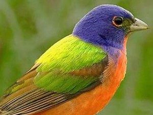
The palette resembles a winter landscape on a bright day with its color contrasts of pure colors, white, black, red and cold green, or tropical islands with bright birds, flowers, turquoise water, blue skies and emerald greens.

Bright warm color. ("Bright Spring"). Creative Palette - "Creative" palette.
www.pinterest.com/shahrazade/ch-bright-a nd-warm /
The leading characteristic is brightness. Additional - neutral - warm. It can be either relatively light or relatively dark in color. The colors are clear, either without obvious impurities, or with a bright golden admixture.
The palette is associated with the world of South Asia, with the bright clothes of the inhabitants of this region, color splashes in their manner of combining colors, with the cheerful colors of tropical nature.

Soft cold coloring ("Soft Summer") - Mysterious Palette - Mysterious palette
The leading characteristic is softness, an additional characteristic is neutral - cold. It can be either relatively light or relatively dark. The colors are softened, with a gray admixture or grayish blue.
The palette is associated with twilight, fog, forest before rain, it creates the impression of a mystery, understatement, a mystery. The colors are very complex and nuanced.

Soft warm color ("Soft Autumn") - "Sensual Palette" - "Sensual" palette
The leading characteristic is softness, the additional characteristic is neutral - warm. It can be either relatively light or rather dark in color. The colors are softened, with a grayish admixture or with a softened ocher.
The palette is associated with earthly sensual femininity, with time before sunset, when the sun paints everything in soft golden tones, with the gifts of the Mediterranean nature - greenery and gold fields, with grapes, cinnamon, olives, figs.

Dark cold color ("Dark winter") "Luxorious Palette" - "Chic" palette
The leading characteristic is dark, the additional characteristic is neutral - cold. It can be either quite bright or slightly softened. The colors are deep with black or dark blue.
It is associated with the luxury of royal courts, with velvet of deep burgundy, purple, lilac, blue shades, with rubies, emeralds, jade and malachite, as well as with the dark night and the depth of the dark blue sky.

Dark warm color ("Dark Autumn") - "Exotic Palette" - "Exotic" Palette
The leading characteristic is dark, the additional characteristic is neutral - warm. It can be either quite soft or quite bright. The colors are deep, with a black or dark ocher admixture.
It is associated with the colors of the Middle East - with the rich ambience of Moroccan interiors, the gold of natural fires, the warmth of spices, the sensual complexity of colors, the rich colors of the southern nature.

Light cold color ("Light summer") - "Innocent Palette" ("Innocent" palette)
The leading characteristic is light, the additional characteristic is neutral - cold. It can be either quite bright or rather soft. Colors are light, pastel, with white or light blue admixture.
The palette is associated with tenderness, freshness, childhood, as well as relaxation at the sea, with light turquoise water, light greens, yellowish white sand, delicate flowers and carelessness.

Light warm color ("Light Spring") - "Tender Palette" - "Tender" palette.
The leading characteristic is light, the additional characteristic is neutral - warm. It can be either quite bright or rather soft. The colors are light, cheerful, with a white or light golden admixture.
The palette is associated with youth, joy, flowering fruit trees, all colors are imbued with delicate gold and remind of the rebirth of nature.

Warm bright color ("Warm Spring") - "Lively Palette" - "Cheerful" palette
The leading characteristic is warm, the additional characteristic is bright. It can be either quite light or quite dark. Colors with a distinct bright gold undertone.
The palette is associated with a meadow in the midst of spring with a multitude of bright colors - lilac, yellow, red, purple, with the golden color of the sun and the blue of the spring sky.

Warm soft color ("Warm Autumn") - "Spicy palette" - "Spice palette"
http://www.pinterest.com/shahrazade/ch-warm-and-soft/
The leading characteristic is warm, additional - soft. It can be either quite light or quite dark. Colors with a distinct ocher undertone.
The palette is associated with spices - pepper, turmeric, govozdik, saffron, mustard and with autumn nature, deep blue water and warm foliage colors.

Cold bright color ("Cold winter") - "Noble Palette", "Noble" palette
The leading characteristic is cold, the additional characteristic is bright. It can be quite dark or quite light. Colors with a bright blue undertone.
The palette is associated with the world of the Snow Queen - with icy luxury, detachment and some drama, this is a palette of precious stones.

Cold soft color - ("cold summer") - "Elegant Palette" - "Elegant" palette.
The leading characteristic is cold, the additional characteristic is soft, it can be either rather light or rather dark. Colors with a soft blue undertone.
The palette is associated with elegance, with the restrained colors of northern summer with blue cool water, bluish-green summer foliage and shades of berries.

All information in this article is the intellectual property of the author, so the repost is only with an indication of the source. =)
Path to Your Charm Project 2014, Color Harmony 2014
Harmony from the Greek harmonia, which means consonance, harmony, the opposite of chaos. Harmonization methods can also be used in a color composition, there are many theories with the help of which they tried to achieve harmonious combinations of colors, many scientists worked on this problem, and not only and not so much scientists studying the physics of color and light worked, but, as a rule, those minds who tried to comprehend how color affects the human psyche, trying to achieve a certain perception by means of a combination of colors. Rudolph Adams and Albert Munsell are among the first to take significant steps in this direction. After them there were many, I will name some who, in my opinion, are currently the most relevant BM Teplov in his theory was based on a circle with three primary colors yellow, blue, red. Shugaeva V.M. and Kozlova V.N., these authors relied on a circle with four primary colors. Accordingly, we will consider harmonies based on the indicated color wheels, and do not forget to mention color combinations where one shade of color is used, that is, a color wheel is not needed.
Harmonious combinations of achromatic colors.
As we have already found out achromatic, we call shades of gray, which range from white to black. How can you achieve a harmonious combination between these colors. Here it is appropriate to divide the process into the harmonization of the colors themselves, that is, building a certain series of colors combined according to one principle or another, which will be used in the composition, and the ratio of the areas on which these colors will be located.
To harmonize achromatic colors, a stepped gray scale is used, or if the composition is monochrome, then a scale of shades of a certain tone. There can be a different number of steps in the scale, it is important that the steps divide the segment from black to white into equal parts, that is, the scale should be equally stepped.
Further, the required number of shades is selected from this scale, that is, the composition can consist of two, three or more shades of gray. Compositions of three shades are considered the most harmonious. Moreover, it should be understood that even when the composition consists of a large number of shades, often at the stage of sketching and compositional searches, they try to reduce it to three shades, for example, the landscape is often divided into three spots, the front middle and distant shots, which try to harmoniously connect with each other by means of tonal relationships. And then, inside these spots, to develop more subtle gradations while trying not to violate the integrity of the three main spots and the relationship between them.
Shades for a composition from a gray scale are chosen either with the inclusion of black, white and one or more grays, or only black and white, such a harmonic scheme is called complete.
If you choose white and light shades of gray, then this scheme is called light gray.
Black and dark shades of gray dark gray.
When shades are taken from the middle of the scale, then this is medium gray harmonic circuit.
Of course, all these schemes are rather arbitrary, for example, the combination of colors can be medium gray, but at the same time be quite dark. And the statement that the composition, divided into three tones, is the most harmonious is also not indisputable, there are different opinions on this matter.
Sometimes the gray scale is composed in such a way that it can be divided into dark shades and light shades, for example, if there are ten steps for example, then you can clearly draw the line between dark and light.
It is believed that if shades are chosen that are located on a gray scale at regular intervals, then such a scheme is the most harmonious, that is, it is perceived as the most calm. If the intervals between the selected shades are not equal, then a more expressive harmony is obtained.
If in practice you have to use a gray or monochrome scale for harmonization, then it is desirable to have a large enough scale with as many steps as possible in order to have more room for maneuver.
For example, in etching there is a tool such as an etching scale, a type of gray scale that is used to obtain certain shades when etching an etching board. So etchers try to make more shades on the etching scale than they will use in etching, and this is done in order to be able to more flexibly and widely adjust the etching process, that is, light relations.
As for the ratio of the distribution of the selected shades on the composition, then there can also be different approaches.
For example, in a composition of three shades, you can go this way, divide the area of the composition, so one shade takes 50%, the second 32%, the last 18%. We get a ratio close to the golden ratio, which will be perceived as a very calm composition.
Or another example, when it is proposed to divide a composition of four tones, thus 1/6 white, 1/6 black, 2/6 first gray, 2/6 second gray, such a distribution allows you to get a fairly calm balanced composition.
In principle, in this case, you can use any harmonious combinations of numbers that both mathematics and geometry offer, which we will probably talk about, someday in more detail, in the corresponding article.
I would also like to say that in fact, the harmonization of shades of gray is the first stage in the harmonization of chromatic colors, that is, artists, before proceeding to create a color composition, often create a black and white sketch. Many photographers also cannot do without a sketch, and often there is more than one sketch. There is a whole technology for the step-by-step solution of all possible artistic tasks, from compositional searches, including harmonization, to a detailed study of the entire composition in monochrome or achromatic version, and then they move on to creating a color composition as the final stage of work. Moreover, similar in many ways similar approaches exist both in traditional artistic technologies and in digital ones, and photography also does not shun such approaches and uses them effectively, especially in retouching and collage.
Harmonious combinations of chromatic colors.
The bottom line is that there are a great many different schemes for combining chromatic colors, they are based on different theories and using all possible color wheels.
Here, first of all, we will consider several of the most commonly used schemes based on twelve particular color wheel, where the main colors are yellow, red, blue, although these schemes can, more or less successfully, be used on any other color wheel.
First of all, it must be said that any harmonious combinations are divided into two categories, contrasting and nuanced combinations... Accordingly, any combination where a clear contrast of colors or shades is used and there are contrasting ones. And close, combinations, as a rule, located next to each other on a circle do not form a clear contrast, are nuanced.
And so are the schemes of harmonic combinations.
Single color (monochromatic); monochrome color harmony - the use of several shades of the same color. This combination is analogous to the combinations of achromatic colors described above. Such combinations consist of at least two colors. Only in the place of shades of gray are shades of any spectral color used here. And a color wheel is not needed to build this harmony, but a monochrome scale is needed, passing from white to black through the required spectral color. Harmony can be contrasting or nuanced, depending on the selected shades.
Harmony of Similar Colors or Related Triad; This color scheme uses adjacent colors on the color wheel and blends them. This harmony is most often used as a nuance one, but contrast is also possible here. White or black can be used as a complementary color.
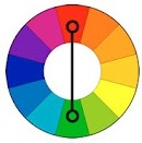
Harmony of complementary colors (complementary); the complementary color scheme uses opposite colors. In this case, the contrast is on the face, and the compositions built on the basis of this harmony can be very contrasting, perceived as dynamic, expressive, even flashy. It is very easy to put emphasis here.
Broken extra; This is again a complementary scheme. But at one end, it divides in two, splitting into two related colors complementary to the third. The combination is even more complex than the previous one and is also contrasting.
The colors lie at the vertices of an isosceles triangle at an equal distance from each other. The combination is quite effective, even if you use pastel colors. Moreover, this scheme can be based on both primary colors and secondary, and even tertiary colors.
The proposed color combinations are used very often in all areas of the visual arts, not only in painting and graphics, but also in photography, design, architecture, and even makeup artists and hairdressers work with harmonious combinations.
But there is an opinion that the primary colors are not three, but four, this point of view is justified by a number of reasons, for example, it is argued, and not unreasonably, that a mixture of blue and yellow does not give pure green. A color researcher like Michael Wilcox even called his book “Blue and Yellow Don't Give Green”.
So the color wheels based on the four primary colors are also used to harmonize the color composition.
Consider ways to harmonize using this circle.
To begin with, let's describe the color wheel, using the example of the circle proposed by Shugaev.
The color wheel, in which the four colors blue, yellow, red, green are considered the main ones.
Between the primary colors, there are four groups of intermediate ones:
- yellow-red;
- blue-red;
- blue-green;
- yellow-green.
On the basis of this circle, a color harmonization system has developed.
Four groups of harmonic combinations have been identified:
- monochromatic harmonies;
- harmony of related colors;
- harmony of related-contrasting colors;
- harmony of contrasting colors.
Monochromatic harmonic color combinations; everything that has been said about the Monochromatic (monochromatic) combinations described in previous models, about the combinations of achromatic colors, fully applies to this group, in fact, this is the same group only the names in different models and different authors differ.
Harmonious combinations of related colors; Related colors are located in one quarter of the color wheel, between two primary colors. Shugaev has four groups of related colors: yellow-red (orange), red-blue (purple), blue-green, yellow-green.
Thus, nuanced color combinations are obtained, calm and restrained, although a certain contrast and emotionality can be introduced into them if you add a light scale.
Harmonious combinations of related-contrasting colors; Relatively contrasting colors are located in adjacent quarters of the color wheel, and not all combinations of these colors are harmonious. There are several schemes, using which you can choose the desired harmony:
- Horizontal or vertical chords are drawn through the circle, the ends of the chords are located on colors equally distant from the general main color, and from contrasting main colors.
- An obtuse triangle is placed on the circle, the long side of which is the chord described above, and the vertex of the opposite obtuse angle is the main color in this combination, the other two located on the other two vertices are respectively subordinate to the main color.
- Colors located at the vertices of a right-angled triangle, the hypotenuse of which is the diameter of the color wheel, and legs, vertical and horizontal chords.
- The colors at the vertices of an equilateral triangle in which one of the vertices is the main color, and the opposite side is a vertical or horizontal chord.
- Four colors located at the corners of a square or rectangle, all of which are horizontal or vertical chords.
As a rule, if necessary, a light scale is added to these combinations.
Harmonious combinations of contrasting colors; Contrasting colors are those located in opposite quarters of the color wheel.
The two colors farthest from each other and, respectively, located at the ends of the diameter, are contrast-complementary. This type of harmony, the most contrasting, potentially very emotional and expressive, generally has the same properties as the "Harmony of complementary colors (complementary)" described above. As in other schemes, it can be supplemented with a light scale.
And here it should be noted that the circles are different, and the schemes that are applied to them are in many respects similar, not in details, but in the main points there is undoubtedly a similarity, what am I for. In fact, there are much more harmonization schemes, and many may well work on any color wheel. It will still not work to formalize the comb to the end, all the same, you have to turn on the flair and compare the colors obtained using the schemes with your own taste, and correct the result and the result can be very different from the one that was obtained using all possible schemes.
Get creative with your combing.
By the way, the schemes proposed in this article are simply the most popular.
For example, V.M.Shugaev, mentioned here, on the 16th private circle revealed 120 harmonious color combinations.
But in some areas of fine art, for example, in design, masters have to work with color literally according to the numbers in the catalog, that is, in a very narrow framework in which the free search for color combinations, as in painting, is simply not acceptable. For example, when creating a corporate identity, you need to very clearly link the corporate colors to the colors available in the catalog. And here sometimes there are simply no options but to strictly follow the harmonic patterns.
When using these schemes, you need to understand that by themselves, apart from the other principles and laws that are used in the composition, these schemes will not work properly, that is, the basic laws of composition, integrity, subordination, expediency, must be observed. No matter how many colors there are in the composition, one is always the main one in one way or another, all the others are subordinate to him, the entire color system is built from him. Yes, there are compositions in which several different colors can act as the main one, for example, in an ornament, but then this composition is divided into several others where in each separate one is always the main color.
And so we examined several ways to harmonize with different color wheels, and different harmonization schemes. The bottom line is that nature does not formally formulate laws as man does, but they undoubtedly exist, and nature exists in accordance with these laws, and in order to comply with them sometimes it is not necessary to use such rigid schemes.
The fact is that in practice and very often artists or photographers do not use the color wheel, and not because it is a bad tool, but because with experience comes the habit of keeping the circle in your head and building color combinations almost unconsciously. Moreover, many generations of artists had no idea about the color wheel, they were simply not taught this, but they still managed to make their works harmonious, how did they manage it.
Even before the invention of the color wheel, there were harmonization methods that did not require the use of the color wheel, and they are still used today. The very nature with which they wrote or drew suggested the necessary color combinations, for example, on a sunny day, all objects, the entire environment is saturated with sunlight, with its inherent color, which creates a certain environment in which everything around is immersed even deep shadows are still in this environment ... And although shadows are usually colder than sunlit places, the environment in which they are immersed still makes them warmer. Or indoors, when everything is illuminated by an incandescent lamp and the environment is even warmer, but the window as part of the composition in which we see a night scene will still not be so cold as to fall out of the overall composition, it will still be immersed in the environment it creates lamp.
This means the environment, that is, any particular shade can work as a harmonizer.
So in Painting and Graphics, as well as in photography, there are a number of techniques that allow you to simulate this effect. Let's start with painting, although in graphics such methods also work, firstly, often, when artists write a scene and select a palette for which they will write, they know in advance what color system they will keep. Will this composition be cold or warm and, accordingly, if, for example, the composition is warm, then even the coldest shades will be warm to a certain extent, this is called to take away to a warm range or to a cold one.
Still often, according to an already painted picture, if it seems to be falling apart in color, that is, there is no color harmony, then they can walk over it with a transparent layer of paint (glaze), thus subordinating the rest of the colors to the color that the given glaze paint had.
Or, for example, a colored soil is made, and some composition is painted on it with a separate brushstroke, thus the soil shines through from under the paint between the strokes and acts as a medium, subjugating the entire color system of the picture.
And by the way, there are many such methods, for example, watercolors write on tinted paper, it shines through the paint and also plays the role of a harmonizer.
And what methods the graphics offer, here you can use a contour as a harmonizer. For example, in easel graphics there is the concept of a drawing layer, it is often implemented in the form of a stroke, (contour) around the main compositional elements, it can combine elements the thicker it is, the more it subjugates all other elements and under certain conditions it can work as a harmonizer , that is, permeating the entire composition, it can play the role of a unifying element that aligns the color scale in the desired direction.
In photography, similar techniques also take place, for example, color filters, which already at the shooting stage already build a color range and work as a harmonizer,
When processing a digital photo or drawing in digital, there are also opportunities for similar techniques.
And one more way of harmonization is a frame and a mat, which can also work as a harmonizer, it is no secret the thicker the frame and the mat or just a color outline around the picture, I mean the ratio of areas, that is, the thicker relative to the image that the outline is framed, the more it is collects the picture more or vice versa makes it more free, as a rule, if around the image there is a darker and wider outline (frame, mat), the more the composition seems to be collected. If the stroke is lighter, then the composition feels more free, in the flesh to the point that the composition may fall apart altogether.
So the frame can work as a harmonizer if you skillfully choose the combination of color and lightness of the frame. Moreover, the frame can fit the composition into the interior, work as a unifying, harmonizing element between the image and the interior, the room in which the image is located.
And more about the color wheel, we have not touched on the topic of practical work with a circle in this article, the fact is that there are color circles not only as schemes, but there are, for example, mechanical dried apricots, or programs based on the color wheel that are specially created for so that they can be used to select harmonious color combinations. I plan to write a separate article on this topic, and in it I promise to talk about such devices and programs.
Of course, the topic of color harmony does not end there, you can still say a lot on this topic, but the tasks of this article do not include telling everything, but rather identify some aspects and awaken interest in this topic.
Once again, be creative, and it will be interesting!
Hello everyone! In this article, we will try to highlight the topic of color matching as much as possible. As a theory, we suggest that you read the translation of an article from the Adobe blog on color harmonies, by Tony Harmer. And for practicing in practice, we have a video lesson: How to match colors in Adobe Illustrator. This lesson will focus on the Color Guide panel, the video can be found at the end of this post.
Color harmonies
Color harmonies are combinations or combinations of colors that are pleasing to the eye. We constantly use color harmonies: when we choose clothes, when we decorate our homes or workplaces, and when we, as designers, want to convey some meaning or mood.Color circle
The color wheel is a tool that allows the designer to select matching colors and make up palettes. Johann von Goethe called it "Color Theory", but there is no real theory here. During the existence of the color wheel, many theories and ideas about color have been developed. But it is the color wheel that is quite convenient to use in practice when color matching. That is why it will be the starting point for our work.
There are twenty-three color harmonies built into Adobe Illustrator, all of which are available in the panel Color Guide (Shift + F3) and tool Recolor Artwork (Edit> Edit Colors> Recolor Artwork)... Therefore, in this post we will cover them.
Features of the color wheel in Adobe Illustrator
Technically, the color wheel in Adobe Illustrator bears more resemblance to the LAB wheel, but visually it is closer to the RYB model, which has more in common with the traditional art model.
The RGB color wheel has red at zero degrees. In this case, Cyan (Cyan) is on the opposite side, that is, 180 degrees. This is exactly what the color wheel looks like in Adobe Illustrator.

In this case, the naked eye can see that on this color wheel, the opposite of red is green, and the blue color is nearby a little to the side. But if you take red and rotate it 180 degrees using the sliders in the Recolor Artwork dialog box, you get Cyan! This is just a feature of Adobe Illustrator, as opposed to, for example, the same Photoshop.
Color combinations, color harmonies
Here we will show you all the color harmonies using color combinations as an example, where red will act as a base.Complementary colors
Complimentary colors - everything is quite simple here, they are located opposite each other on the color wheel.

There are 4 variations in Adobe Illustrator for complementary harmony. They are no longer so strict in comparison with the classic complementary colors, that is, small deviations from the opposite arrangement of colors are allowed.

Analogous colors
Analog harmony generates four complementary colors with tints located 15 and 30 degrees clockwise and counterclockwise from the original color. The brightness and saturation of colors changes. There is a variation of analog harmony with 5 colors.

Monochromatic colors
This harmony generates variations in saturation and brightness. There are three of them: Monochromatic, Monochromatic 2 and Shades.

Triadic colors
In triadic harmony, colors are arranged in 120-degree increments along the color wheel. As in the previous cases, there are variations with additional colors and changes in hue and saturation.

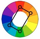
Square and rectangular diagram (Tetrads)
Tetrads are most often referred to as square or rectangular color combinations. You can also see a diamond in the position of the flowers on the circle. The original Tetrad generates three complementary colors in 90-degree increments. But there are, of course, variations.

Compounds (secondary)
Composite colors are those that can be obtained by mixing the main colors (red, yellow and blue). Harmony Compounds work in a similar way, giving compound colors to match the base color.

High Contrast
High Contrast are essentially triadic harmonies that include the rules for some other color combinations.

Pentagram
And we will finish with the harmony of Pentagram. These are five colors in 72-degree increments on the color wheel. The saturation and brightness of colors also changes.

This is where we can end our journey into the world of harmonious colors. But we don't want you to be limited by these rules. People make up the rules, and they tend to make mistakes. That is why the rules can and even should be broken. The harmony of Adobe Illustrator can be a starting point for you, and then amazing discoveries and creative experiments await. Any harmony can be edited through Recolor Artwork. So good color combinations and fruitful creativity!
How to Match Colors in Adobe Illustrator
In this video tutorial, you can take a closer look at the Color Guide panel. We'll walk you through how to use the Color Guide panel to pick color combinations based on harmony. Also you will find a review of the professional monitor for designers BenQ PD2700Q.Another video on color matching. This time we are considering such a tool as Recolor Artwork. Thanks to Recolor Artwork, you can pick colors in Adobe Illustrator right on the color wheel, recolor an illustration, adjust brightness and saturation. In addition, a review of the professional 4K monitor BenQ PD2700U.
And one more video for a snack. Useful scripts for working with color in Adobe Illustrator.
Want more practice?
Dear friends,
when working with color, the goal of an artist, a designer is to create color harmony.
Color harmony- this is the consistency of colors with each other as a result of the found proportionality of their areas and shapes, balance and consonance, based on finding a unique shade of each color. This harmony should evoke certain positive feelings and sensations in a person.
By the nature of psychophysiological perception, it is customary to subdivide harmonic combinations into five color groups: one-tone harmonic combinations of colors, harmonic combinations of related colors, harmonic combinations of contrasting colors, harmonic combinations of related-contrasting colors and harmonic combinations "Triad".
- Monochrome harmonic combinations built on a single color basis. They are created by combining the selected color with its light and dark shades obtained by adding white and black. As a result, strong tonal contrast can be achieved on the one hand and subtle color relationships on the other. The overall color tone gives the monochromatic combinations a calm, balanced character.
Monochrome harmony
Depending on the tasks set, color harmony can be organized in different light ranges. For example, using the full light range expresses calmness, stability. The selection of colors, separated from each other by different intervals, contributes to the manifestation of activity, color intensity. To express dynamic contrast, choose two colors with a small tonal interval between them and the third with a larger interval. The uniform ratio of the areas occupied in the combined colors confirms the statics, the uneven one - the dynamics.

Monochrome harmony in nature
- Harmonious combinations of related colors are achieved through the use of three colors located side by side in the color wheel. Due to the proximity of the location, these colors can be easily combined. This harmony can have a lot of depth, rich personality and elegant look. The harmony of related colors is based on the similarity of color tones (or on their slight contrast in color tone) and evokes a sense of balance and calmness.

Harmony of related colors
The introduction of a small amount of white or black into combinations of related colors leads to harmony, enhances the emotional expressiveness of the composition. Active light contrast is inherent in the harmonies of related colors, contributing to the expressiveness of tonal combinations. For example, equally saturated three color tones of the same lightness do not form subtle color combinations. As soon as black or white is added to two of the three matching colors, the color combinations acquire consistency.

Harmony of related colors in nature
- Harmonious combinations of contrasting colors are created by using two colors that are opposite each other in a color wheel. This technique is usually used to create accents, as the combinations of these color pairs have the greatest color contrast, causing active sound, tension and dynamics of the composition. This allows one color to complement another in such a way that one of them attracts attention and the other is the background.
Harmony of contrasting colors
Starting to create contrasting harmonic combinations, first select the original color, then determine the corresponding contrasting color. By creating a harmony of contrasting colors, you can add achromatic colors to each of the combined colors.

Harmony of contrasting colors. Square
"Square"- a variety of harmonic combinations of contrasting colors of four colors, equidistant from each other.
Harmony of contrasting colors. Tetrad
"Tetrad"- a kind of harmonic combinations of contrasting colors of four colors, in which two pairs of colors are located opposite each other.

Harmony of contrasting colors in nature
- Harmonious combinations of related-contrasting colors Is the most common type of color harmony, forming an isosceles triangle in the color wheel. Here harmony is achieved through the use of any color and colors adjacent to its complementary. These colors are softer than a combination of just two complementary colors.

Harmony of related-contrasting colors
A characteristic feature of drawing up harmonious combinations of related-contrasting colors is the presence in the combinations of the same amount of the main and contrasting colors.

Harmony of related-contrasting colors in nature
- 5... Harmonic combinations "Triad" - a combination of three colors, equidistant from each other and forming an equilateral triangle in the color wheel. This scheme is popular with artists because it offers strong visual contrast while maintaining balance and color saturation. This composition looks quite lively even when using pale and desaturated colors.

Harmonic combinations "Triad" show very distinct and strong color combinations, being, however, the most difficult from the point of view of correct creation. To achieve harmony in the triad, one color is taken as the main one, and the other two are used for accents.
Triad in nature
However, it should be remembered that in creating color harmony, not only the colors themselves are of great importance, but also the configuration of the spots, the size of the areas of the compared color tones. There is an obvious relationship between the different colors of any composition, each color balancing out or bringing out the other, and the two together affect the third. Changing one color leads to the destruction of the coloristic, color harmony of the artwork and makes it necessary to change all other colors.
Color harmony is the consonance of colors, their compatibility, a beautiful ratio. Often, artists achieve harmony in their works, relying on intuition and an inner sense of color. This feeling grows in the process of constant work. However, harmony in color is based on certain laws. In order to understand these patterns, you need to use the spectral wheel or color wheel.
Three primary colors.

A color wheel is a scale of shades of color arranged in a circle. These colors are arranged in a specific sequence - just like in a rainbow. Therefore, the color wheel for the artist is almost the same as the periodic table for the chemist. Among all the colors of this circle, there are three, which are called basic: yellow, red and blue. All a huge variety of other colors are formed by mixing these three (this is applicable for the light reflected from objects in the CMYK color model; if the light is emitted as on a monitor, then this is an RGB color model and here mixing occurs according to other laws, between green, red and blue) ... But in practice, it is not always possible to achieve the desired color sound, since paint pigments have certain limitations. For example, if you mix red (scarlet) and blue (azure), you get a dirty purple color. If red (kraplak) and blue (ultramarine), then a pure violet color is formed. But this is not always enough, therefore, cobalt purple or purple kraplak are also produced. Its color is very intense and clear. Thus, despite the fact that in theory you can get all the colors from just three basic ones, in practice artists use a large number of colors. However, the main ones are blue, red and yellow. On the color wheel, their positions form an equilateral triangle. These colors cannot be obtained by mixing others.
Color saturation and brightness.

Any color has a number of characteristics. The main things for an artist are saturation and brightness. These are different concepts. Brightness refers to how much the selected color is lit. That is, any color can be lighter or darker with the same saturation (close to white or black). Saturation means the strength of the color, so to speak, its "richness". It can be different at the same color brightness (or illumination). The lower the saturation of the color, the more it approaches gray shades. This can be clearly seen in the given table of colors.
Harmony of contrasting colors.

The color wheel contains colors that are opposite each other. These are contrasting colors. They form the most contrasting combinations. For example, if you place red next to orange, then it will not stand out much. But if the same red color coexists with green, then it will seem to "burn". That is, green and red reinforce each other, create contrast. If you look closely, then red and green are located in the color wheel exactly opposite each other. There are three pairs of contrasting colors: red-green, yellow-violet, orange-blue. These are opposite colors, forming the most contrasting combinations.
Harmony of related colors.

Colors located within one quarter of the color wheel and having one common shade in themselves are called related. They seem to be "related" by the common color contained in them. There are many related flowers. For example, red, red-orange, orange-yellow. They all have a red color. This unites them. Therefore, they are called related. There are the following four groups of related colors: yellow-red, red-blue, blue-green, green-yellow.
Harmony of related-contrasting colors.

Relatively contrasting are contrasting colors that contain one common color that unites them. Relatively contrasting colors are located in two adjacent quarters of the color wheel. There are four groups of related-contrasting colors: yellow-red and red-blue, red-blue and blue-green, blue-green and green-yellow, green-yellow and yellow-red.
Chromatic and achromatic colors.

All colors except black, white and gray are called chromatic. Accordingly, achromatic colors are shades of gray, white and black.
Warm and cold colors.
Warm colors are yellow, orange, red, brown, beige and many similar shades. These colors are associated with the warmth of fire. Cool colors: blue, cyan, violet, green, as well as a large number of colors derived from them. Cold colors are associated with coldness, freshness, spaciousness ...