Let's talk about color: the rules of combination and influence. Color combinations in the interior Color combination table
An article on how to correctly arrange colors in the interior. Examples of successful design solutions.
Listening to the conflicting advice of designers, you can endlessly choose the color of the curtains for the wallpaper or the wallpaper for the color of the furniture. But there is an easier way: nature has already created many harmonious and bewitching color combinations, and a person is arranged in such a way that it is these ranges of shades that are most pleasant for him.
Neutral natural shades in the interior, a combination with green: ideas, photos
Imagine a landscape that pleases the eye. Pay attention to the dominant colors and bright accents. If you repeat this combination of colors in the interior, it will be successful.


For example, you already have a light alder-colored linoleum, reminiscent of river sand. So you can complement it with light greens, golden orange or delicate blue, but by no means dark purple, because such a combination of colors is difficult to find in wildlife.
Interior in combination with white: ideas, photos
Snow-white wallpaper in the bedroom evokes thoughts of winter. Light shiny curtains and soft white textile like fallen snow.
Bedroom in combination with white and in gray
The correct combination of colors in the interior: table
It so happens that redecorating completed, but in the room, as if something is missing, I want to add some kind of “zest”, to make a color accent. At the same time, there are fears that objects of a different color, whether sofa cushions, lamps or paintings will not fit into the overall range and will look completely different.
Do right choice A color combination chart will help.


There are some general rules for arranging colors:
- As in clothes, in the interior, more than three colors should not be combined, everything more is too much. With the difference that when it comes to the interior, color means its whole gamut, that is, light green and grassy - this is one and the same color.
- Light shades visually expand the space, while dark ones, on the contrary, narrow it. The same can be said about the pattern: it seems that a wall with a small pattern is located further than the same wall with large elements on the wallpaper.
- If there are more than two colors in the room, then they should be in harmony with each other in saturation. For example, bright lemon and orange chairs in the kitchen or colorful pastel sofa cushions. It is desirable that the texture of objects is also the same
How to choose a good combination of beige color in the interior: a play of shades, ideas for a light interior
Beige color considered basic and neutral, but it can be very different. Beige can be grey, pink or warm yellow. Please note that the top color in each of the photos can be called beige, but these colors are all different! If in your design project some other color is provided, choose beige with its notes.


For classic design suitable combination beige with white, gray and dark wood. It is this unobtrusive range that is often used for the most luxurious living rooms.


The combination of gray in the interior in a modern style: ideas, photos
Gray evokes thoughts of rainy weather and autumn slush. But this is one of the basic colors of high-tech style! What else should be present in an urban space besides gray? Lots of glass, metal and, preferably, neon lights.

IN classic design the combination of gray and white is also quite appropriate. Agree, gray furniture is much more practical than white.


How to choose a good combination of colors in the bedroom: ideas, photo projects
It is believed that the bedroom should be a place of rest and therefore it is better for her to choose an unobtrusive light interior in pastel colors.


Interior in dark colors
But in luxury hotels, bedrooms, on the contrary, often use deep dark shades, the interior is dark colors makes the room visually smaller and more comfortable. In such a bedroom it is easier to fall asleep if it is day outside. So, for example, the presidential suite in one of the Hilton hotels looks like:


Psychologists say that the color of the interior in the bedroom should be chosen in accordance with the character of its owner: orange and lemon color will give you a boost of energy.
For those who cannot fall asleep for a long time, a combination of green color in the interior with white is suitable, which embodies calmness and lightness.
The combination of brown in the interior: ideas, photos
Rich chocolate shades, look simply luxurious. The combination of brown in the interior with white will make the interior lighter.
Dark shades visually make objects heavier, so they are usually used below. For example, a dark brown base of the bed and the same bottom of the walls and a light bed and ceiling.
The appropriate combination of colors in the living room in bright colors: ideas, photos
The interior of the living room is different, ranging from minimalism to classic baroque, with its excessive pretentiousness and an abundance of curlicues. And for each style it is appropriate to choose an interior in white colors. But white itself looks too sterile, so it will not be superfluous to dilute it with bright colors.
In combination with light in green and tropical plants, a white living room will evoke completely different associations. It will become like a board of a yacht or a cruise ship floating somewhere in the tropics.

There is a certain rustic simplicity in the Provence style, but such an interior seems cozy and cute.
 Living room from Provence
 Interior in white and black colors: ideas, photos
For a strict and discreet living room suitable interior in white and black colors. The charcoal black color seems to be created in order to emphasize the geometric regularity of the forms. Shades of gray will help smooth out the contrast a little.
Photo wallpapers are not in fashion now, but in black and white they will look stylish and become the hallmark of the interior.


A bright combination of colors in the kitchen: ideas, photos
The kitchen is a room for which you can choose bright colors. juicy colors without fear of going over the measure. The only rule is that there should be only one bright motif in the interior, for example, the color of fuchsia.


Some argue that supposedly juicy color combinations stimulate the appetite and are therefore not suitable for those on a diet. In search of a compromise, you can choose white and black in the interior, and then add red notes. Such a kitchen interior looks both bright and discreet at the same time.


Lovers of spring greenery should like the interior of the kitchen in these colors, the combination of green in the interior with wooden facades looks natural.


Ideas for combining colors in an apartment: photo
To create the impression of a common space, there must be something in common in all rooms of the apartment. It can be a combination of colors or the same color that is present in every room.

The impression of unity in interiors can be achieved without the help of color, using the same textures and finishes, for example, everywhere. glossy ceiling And embossed wallpaper. Helps to visually unite rooms and the same flooring if there are no thresholds between the rooms, and they have the same decor elements, it seems that they smoothly flow into each other.
Create comfortable and harmonious interior You can not only choose the design of the space, but also correctly combine colors in the interior. They are able to influence the emotional and physical state of a person. Thanks to correctly selected color relationships, the house and its owner become an integral organism.

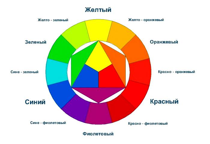
The color wheel is one of the important tools for drawing up the right color combinations in the interior. Issac Newton was the first to systematize the spectrum, decomposing the white beam of light into red, orange, yellow, green, blue, indigo, violet. It was the first color scheme.

Today, color wheels consist of one, two, and three discs. They show what the relationship is between the colors arranged in a circle. On the axis of the circle are all the colors of the spectrum - primary, secondary and tertiary. For example, Itten's color wheel:

primary colors
All colors, with the exception of white, come from primary colors. Blue, yellow and red (the triangle in the center of the circle) are the primary tones. Combinations of these three colors make up the secondary colors.
secondary colors
The next six colors of the circle are obtained by mixing two primary (primary) colors. For example, purple is obtained by mixing red and blue, and green is blue and yellow, but orange is a combination of red and yellow.
Tertiary colors
If you mix one primary color with a secondary color, you get a tertiary tone. Total - 12 colors. You can also get a tertiary color by mixing a base tone with a lot of another base tone to create a tertiary color. For example, one part blue tone with two parts red will create a red-violet color.
Advice
:
It is important which colors are located next to the tone that interests you, as well as those that lie opposite the color you have chosen. For example, yellow goes well with the opposite purple, and light green is harmonious with the color of bright pink or fuchsia. Next to yellow are two colors with which you can make harmonious chromatic combinations.
Shades and midtones
Hues are derived from the base color. For example, blue has a light blue and dark blue hue.
. Hue is the result of adding white and black (gray) to the base color. Tone, unlike pure pigment, makes the color softer and more pleasing to the eye.
How to mix colors
The perception of color depends on the distance of the color spot from the human eye. For example, as the distance increases, green looks more bluish, yellow starts to turn orange, and orange turns red.
. The saturation of the color tone of the interior depends on the illumination of the interior. The light level ranges from light to dark on a gray scale. The floor and walls are capable of reflecting light, so the light colors of the surfaces in the room enhance the brightness, and the dark colors dampen the tones, making them dull.

Advice :
.The quality of the brightness or depth of a color tone depends on the light and shadow in the interior. Therefore, adding a gray tone to the design of the room can noticeably soften the effects of various color combinations.
. If you need different shades of blue, dilute the color combination of the interior with a black tint. And then the cold tones of blue will sparkle with tone gradations.
. To change the shade of any paint in the interior, add White color. It will dilute and extinguish unnecessary brightness in a combination of colors.
Color Proportion Scale
On this scale, you can determine the proportions of tones and semitones. A safe ratio for color combinations in the interior is 70/20/10.
70% tertiary shades in a neutral base
20% - secondary colors
10% - primary color

Advice
:
Practice moderation in mixing colors! Try not to mix more than a few shades. Two or three colors in a neutral base are considered the safest.
Various color schemes
Color schemes and triads are a set of interior color combinations that work together to create a visually appealing palette. Color combinations given in color schemes can be considered classic. Of course, the possible color combinations are endless. But experienced designers feel which of the schemes to apply in practice.
Classic triad
A combination of three colors that are at an equal distance from each other. The use of such contrasting combinations will create a harmonious palette. You should choose one main color, and use the other two as accents.

analog triad
Combinations from 2 to 5 colors located next to each other make up similar combinations or related ones. For example, yellow-orange, yellow, yellow-green, green, blue- green color.

Complementary combinations
A complementary color (also known as a contrast) that is opposite the second one on Itten's color wheel. The combination of these colors creates a bright and exciting effect, especially at maximum saturation.

Rectangular pattern
A combination of four colors is a scheme consisting of one primary color and two additional ones. The company includes another additional tone to highlight accents. For example, blue-green, blue-violet, orange-red, orange-yellow.

square scheme
A combination of four colors spaced equally apart. Dynamic colors are different in tone and, at the same time, complement each other. For example: purple, orange-red, yellow, blue-green.

Rules for using the color scheme
Color combinations in the interior are conditionally divided into warm and cold. Thanks to them, you can visually enlarge or reduce the room. It all depends on the chosen basic tone. Therefore, the selection of complementary colors is so important. They are located opposite each other on the color wheel. Each tone brings out the richness of the other. When using complementary colors, one color should be soft and weak in tone, while the other should be more dominant. For example, intense dark purple should be paired with light yellow hues.

Decorate adjoining rooms in a similar range of colors. Plan your color scheme based on how each room is viewed from the other. Look for related colors. For example, related tones are located next to each other on the color wheel. These colors produce less contrast effects than complementary colors. For example, the dark tones of a blue-green room in combination with a light blue scale adjacent premises can give you the feeling of floating in a blue lagoon.

Choose the base color you like best and use as many shades of it as you can think of. For example, they give maximum effect when adding related or complementary colors. Contrary to popular belief, monochrome is not a black and white duo or one single color. True monochrome combinations often consist of one main tone and several adjacent tones. For example, green color can look quite independent and self-sufficient. It fills the entire space of the interior, but this is only at first glance. If you look closely, you can see the tones of apple and grass, young greens and swampy mud in shades of khaki, juicy lime and pistachios, transparent candy in yellow-green tints and olives. All these shades are successfully emphasized by white, gray, as well as interspersed with tones in the colors of metal and wood. So, in general, you get monochrome!

Advice :
Choose one favorite color that will become the main one in the interior. And then add to it objects and accessories in shades and midtones of the same color, and dilute this complex monochrome range with things in neutral shades. But only a little - in order to shade the main palette.

First decide where you are going to use the colors in the room. General rule when decorating is to use three different values in a combination of colors: light, medium and dark. Walls and floors are usually decorated in light colors, depending on the effect you are trying to create. The floors should be a little darker than the walls to avoid a floating effect. Window sashes and large pieces of furniture are often created in the middle to connect light-colored walls and floors. Dark colors should be used as color accent in the interior.

Color temperature
Some color combinations in the interior are warm, others are cold. Psychologists say that the color of the room can affect the mood and well-being of a person, cause him an emotional response. Some combinations of colors in the interior create an overall feeling of calm and physical satisfaction, while others cause internal tension and discomfort. Colors can be as ideal partner, and the enemy, with whom you will have to unconsciously fight.

Warm and cozy colors
for the interior are located on the right side of the color wheel. They radiate positive energy and power that can unite people.
Red
exudes energy, strength and passion. Restaurants and bars often use this color of strong energies because it increases appetite and promotes communication. And it's a common choice for kitchens and dining rooms in the home. However, red should be avoided in the bedroom.

Orange
This color is considered exciting and powerful. Its presence in the kitchen and dining room is known to increase appetite and relax. Psychologists advise using orange in moderation. Orange is less aggressive than red. It creates warmth and a feeling of joy. However, it is advised to use it only as an accent color.

Yellow
Sunny shades of yellow are associated with happiness and warmth, but rich and vibrant yellow tones can increase frustration and anger. Generally, yellow is an uplifting color. When overused, yellow can become distracting and overwhelming. Don't allow this color in large quantities in a child's room because babies are known to cry a lot. But using it in the kitchen in tandem with orange will cause positive emotions and even euphoria. Yellow has different effects depending on how and in what quantities it is used.

Cool and soothing colors
Cool and soothing colors located on the left side of the color wheel provide a sense of calm and a sense of trust:
. Green. It is a calming and refreshing color that reminds us of young greens, grass, pistachios and juicy limes. It fits easily into any room. Green conveys a sense of renewal and growth. It is used in rest rooms, such as bedrooms. Often different shades of green can be seen in the kitchen. And, of course, in nurseries, because children love everything natural so much, especially colors associated with nature.

Blue
If you're trying to create a calm, spa-like environment, consider blue. Like green, it is a calming color and also good for decorating a bedroom. Iridescent and bright shades of blue are used in offices to increase productivity. Light blue can make a room appear bright and refreshing, while deep blue creates a sense of dignity.

Purple
This color has long been associated with royalty and wealth. It contains the calmness of blue and the energy of red. In combination with some active tones, it stimulates creativity and vitality. However, in large quantities and in tandem with red, it becomes hazardous to health, causing euphoria.

Advice :
It should be mentioned Brown color, as the most common in interiors. Brown consists of several colors, which are based on warm and cool tones: red, yellow and blue. Dark brown or wenge is obtained by adding black to this triad. Brown represents restraint, reliability and modesty. This is one of the most powerful tranquilizing colors, it belongs to the warm colors of the earth, therefore it has become the basis of a psychologically calming palette.

Brown goes well with color combinations in the interior, for example, with gold, as well as tones close to it in shades, for example, with yellow. If we ignore the interior, many people associate brown and red colors with warts. Follow some principles so that they don't bother you.

The appearance of purple in brown is suggestive of subtle, idealized relationships and feelings. Such combinations are appropriate in living rooms, dining rooms, where an environment that brings pleasure to the body is needed: delicious food, luxury items, beautiful accessories and furniture.

Color combinations in different rooms
Before choosing a color for the kitchen, living room, bedroom or nursery, you should remember that white plays an important role in the palette.
White
is the basis of the spectrum. It really helps to refresh the space and creates a feeling of cleanliness. Therefore, this color is always appropriate in pastel colors, combinations of various colors of a neutral palette in the interior. But even warm and burning shades from Mexican interiors allow white as a complementary and accentuating blue and blue combinations colors.
Pastel color combinations
Pastel colors are the result of adding a large number white in various combinations of complementary colors. They create a comfortable, spacious feeling in any room.

Neutral color palette
Shades of white, beige, dark brown, gray and black form the basis of neutral color combinations. The neutral palette is the lightest and most airy for one obvious reason: all those neutrals blend with most of the colors in the circle. They can be stylish and dramatic. For example, black and white as neutrals make for a great palette of complementary hues for different base tones.

Advice
:
If you choose neutral color combinations in the interior, use bright accessories to accent the walls and make interesting room. When you're ready for a change, just change the color of the accessories.
Bedroom
The interior of the bedroom is usually created in soothing colors. However, thanks to various combinations colors using complementary tones, designers have opened up a lot of possibilities. For example, combinations of gray and beige colors in the interior of the bedroom create the most light and weightless intimate spaces in which one could take a break from the hustle and bustle of the day.
For example, gorgeous bedrooms, which are dominated by pearl-pearl shades, combined with a beige tone.

A bright bedroom is created when you choose one intense and colorful base color, such as pink in shades of fuchsia. The selected color on the color wheel is combined with light yellow. They complement each other, but by introducing white, or the related khaki yellow, you will get a more balanced interior.

A bedroom in gray colors is a "refuge" for a person who seeks to retire and get away from the bustle of the outside world. Bedroom in gray tones indifferent to the bright and conflicting outside world.

Red hues between warm related yellows, peach and orange tones, which are complemented by combinations of blue, turquoise and blue. The impression of contrast is masked by grays and whites, which actively participate in the overall palette.

A bedroom with color combinations, among which turquoise dominates, looks optimistic. In such an interior, it is important to create a complex color scheme, consisting of several additional tones, for example, khaki, blue, light blue. As well as tones that are located opposite blue-green on the color wheel, namely, beige, light yellow or even peach, but you need to feel the measure. Because with the introduction of warm bright shades, the room will become like a guest room for communication.

Fashionable Scandinavian style found its reflection in the bedrooms. The main tones in color combinations are brown and purple, which require the support of calm shades of gray, lilac and grass. The natural range is combined in such a bedroom with airy shades of frosty air.

A bedroom in blue tones gravitates toward peace and perfection. Nothing seems to distract from relaxation. With a minimum amount of furniture, it looks extravagant. If you add islands of white and cream to blue, this will soften the pressure of blue. In rooms that serve as a place of rest, blotches of optimistic pink are preferred. Bedroom in lilac tones

Raspberry color in the bedroom - for extravagant people. And to enhance the extravagance of purple, partner yellow and neutral black in the colors of shiny nickel help to enhance the extravagance.

Living room
The room in gray-blue combinations is very calm, sustained and requires the introduction of neutral tones - black and white, which dilute the harsh atmosphere of two related tones.
Blue is almost incapable of getting bored, it is fresh, serene and promotes friendly relations between people. But dark blue combinations evoke nostalgia for the past. The situation will be corrected by small blotches of pink and purple, turquoise and white. The introduction of yellow will create a joyful atmosphere in the living room.

Color combinations in neutral tones are the most fertile theme in the interior. After all, in such rooms you can relax with your family and gather friends. You won't get tired of combinations in neutral colors. The main gamma is wenge and adjacent colors: beige and gray - all colors of the earthy palette. And yet, two or three bright inclusions will not hurt from the tones located opposite these combinations - orange and pale green, two color partners.

A living room in a green palette evokes pleasant sensations, reminiscent of spring young grass, the first summer apples. Fresh, juicy and delicate green tone in the interior should be supported by related shades. And if you succeed - your living room will become a favorite place for your family and popular among guests. And believe me, no one will want to leave you for a long time.

Two colors - pink and azure - are simply created to be together! Additional beiges, whites and grays keep the bright fuchsia at bay. All together they are included in the classic triad on the color wheel, complementing each other.

A bright room requires a combination of tones that are self-sufficient in brightness, the basis of which is red-pink and dark gray. No less juicy will be tertiary shades located on opposite side pink and red.

The ocher tone of the living room accepts brick and orange, as well as additional tones of gray, khaki and light blue. Orange can be introduced into the design in accessories.

Bathroom
A tiffany or sea breeze bathroom is a pleasant color scheme made up of related tones, the primary of which is blue.

Pink is not typical for a wet room, but if you have a pink bath, then the whole room should be dressed in pastel shades of pink, diluted with gray.

Green combined with related tones and white gives a stunningly refreshing feeling.

Children's
Children's room in beige colors must be combined with pink and light green flowers in delicate shades. White color will not hurt to create complete harmony.

A room in lilac tones, as a rule, is made for girls. Lilac is a tertiary color formed by two tones: secondary pink and primary blue. Lilac brings a touch of playfulness and carelessness.

Kitchen
Peach dining room only at first glance seems bright, if you look closely, you can see a combination of several primary, secondary and tertiary colors in the interior. Primary yellow found partners among tertiary peach (yellow + orange), secondary light orange and beige.

Olive is a complex secondary color formed by two primary colors: yellow and green. It is included in the spectrum of green, which carries freshness, youth and vitality. Yellow, participating in combinations with green, softens this tandem. The resulting yellow-green with a large percentage of yellow symbolizes peace and contemplation.

Conclusion
The perception of color is purely individual. Therefore, when composing the palette of your interior, do not limit yourself to the generally accepted, be guided by your own worldview and desire to do something special. Do not forget that only your favorite colors will bring joy. And to create color combinations in the interior, using the primary color as a basis, the color wheel will help you.
Few people attach importance to color, although it affects people quite well. Therefore, everyone needs to know the combination of colors in the interior, the table of which is given in the article. Indeed, with the help of color, it is possible to create beautiful visual effects that surprise others, as well as bring a special psychological atmosphere to your own home. Thanks to this, it will be much easier to arrange guests to yourself and charge them. positive emotions for a long time.
The psychology of color
Everyone on their own creates around himself the environment that will affect his psyche and health in general. In order to simplify the task, the experts made a clear formula, called the "table of color combinations in the interior" (photo can be seen below).
Proper use should be considered when choosing both the main tones of the room and additional ones. The colors that surround us should reflect the characteristics of a person’s character, since it is only thanks to this that living in own house will become much more comfortable.
People are able to perceive one or another color both with their eyes and with their whole body. As you know, tone determines our mood, has a good effect on health, and is also able to improve or worsen well-being. Even in ancient times, it was believed that the color, with its correct selection able to cure any ailment. Even in the country rising sun often used the healing properties of certain flowers.
Color options
Thus, the table of color combinations in the interior of the kitchen recommends using a purple tone, as it is extremely closely related to creativity and is able to make a person develop his own imagination. He is the first assistant in case of a pessimistic mood, in those moments when faith is lost and despair sets in.
White color has a connection with spirituality. Thanks to him, we can gain confidence, although we should not forget that with a long stay in a room of this color, a person can dramatically change self-esteem. He quickly begins to feel some kind of inferiority or, conversely, superiority over everyone else.

It can improve the circulatory system. It affects blood circulation, and also has a unique property, which is to activate the growth of red blood cells. This color makes the nervous system work and promotes the production of adrenaline, increased pressure.
In a room decorated in yellow, all bad moments are instantly forgotten. Here you can get enough energy and gain a sense of protection. In addition, color improves the functioning of the digestive system, activates cognitive processes.
For the purpose of reconciliation, green tones can be used. This color calms and unites people. One of its main advantages is the fact that people suffering from claustrophobia will feel much better in a room with a predominance of green. In addition, it treats lung related diseases and flu faster than some medications.
The blue color allows our consciousness to leave the framework of reality and plunge into the world of dreams and thoughts about something distant. The tone allows us to relax, it perfectly helps those suffering from insomnia, frequent stress, migraines and so on.

Few people love brown, but its benefits are important to almost everyone. It makes more resolute and persistent people who succumb to public opinion, who do not have self-esteem. Thanks to him, a melancholic mood is created, joy appears, and all bad things are forgotten.
Color combination theories
The combination of colors in the interior, the table of which helps to clearly determine the correct formula for choosing the tone in a particular room, is determined by theories. They are combination methods, that is, formulas that have been carefully developed with the aim of finding colors. On the this moment There are several theories, but the most common of them are the color wheel, as well as its antipode, which are described below.

Color circle
As you know, the combination of colors in the interior (the table is provided below) is based on three primary colors:
- Red;
- yellow;
- blue.
They can be mixed, getting additional tones, for example:
- purple (blue and red);
- green (blue and yellow);
- orange (yellow and red).
When connecting the main and you can get an auxiliary. Based on this, a color wheel is obtained, where the following colors are present:
- adjacent - located next to each other (example: green, light green and yellow);
- monochrome - are shades of only one color, located on a straight line, where light tones go closer to the center, and dark tones go to the edge;
- complementary - colors that are clearly on the opposite side (example: blue and orange).

The main thing is to correctly navigate this issue and choose the perfect combination of colors in the interior. The table (green and other colors are also presented in it) will help to do this. You can choose according to the following formulas:
- triadic combination. For this, as a rule, three colors are taken, located in a circle at an equal distance from each other.
- Separated complementary scheme. There are also three colors, but they are selected according to a different formula. The main color is taken first, followed by its complementary color, which, in turn, is divided into two tones that are at an equal distance from it (to the right and to the left).
- Double split complementary scheme. There are already four colors in this color scheme. The first step is to select two main, and then two complementary to them.
Antipode
Individual and overly bright personalities are ideally suited for a paired combination of colors in the interior. Of course, the table includes brown and tones close to it, but they are used extremely rarely. As a rule, businessmen or simply creative people decorate their own workplaces with such shades.

The antipode is a choice of a pair of primary colors, which must necessarily contrast with each other. These are the following combinations (in the circle they are all complementary):
- pink - light green;
- green - red;
- black White;
- lilac - yellow.
Now it’s clear how to use tables and what is a combination of colors in the interior. The table given above - the color wheel - undoubtedly helps in choosing a tone. But in addition to it, it is also necessary to take into account the recommendations of specialists, which guarantee an excellent result.
The best option to choose the perfect combination of colors in the interior is a table. Beige color, as an example, suits absolutely any room. Therefore, most people, not knowing which color to choose for a particular room, pay attention to it.
It is not always easy to choose a combination of colors in the interior. The table (the lilac tone is given separately below) contains many colors, among which there are also universal ones. But when a dilemma arises, one should not choose tones at random. In one room, it is recommended to use no more than four colors.

Incompatible colors
Colors that should never be used together are also included in the basic rules showing the right combination flowers in the interior. Table ( grey colour there is always present) incompatible tones are also important.
Experts advise avoiding pairing cold light shades with warm dark ones. In addition, combinations of cold dark and warm light colors should not be allowed. Today they allow a combination of the incompatible, so creative lovers can combine any shades they like. But still, you should pay attention to the table of incompatible colors:

The principle of one-color selection
There are gamma options only within a single color. For this, a table is not required, since different shades of the same primary color are always combined with each other. For example, a green tone would be ideal, which can be used in any room. After all, greenery can soothe and help organize a productive vacation.
Color Contrast vs. Harmony
The ideal combination is such an interior in any case will be advantageous, as these colors complement each other perfectly. Most often, this combination is used in children's rooms or living rooms. will be reminded of sunlight and warm, thanks to which the house will be filled with an atmosphere of hospitality and kindness. In the kitchen, it will be enough to adapt some accessories of such colors in order to awaken the desire to prepare delicious and creative dishes.
We will send the material to you by e-mail
Choosing the right color palette has importance when designing any space. So we'll talk about ways to combine colors in the interior and the effect of color on a person's mood. Let's also see how the table of color combinations in the interior can help in independent planning room design.
The color scheme is an important component of any interior.
It is necessary to know not only the meanings of each shade, the ability to correctly combine tones is important. To apply optimal color combinations in the interior, a color wheel and a design table are used.

Before learning about the options for combining shades, let's learn about their meanings in our lives. According to psychologists, they can have an impact on our mood and even our emotional state.
The color that gives a cheerful mood and warms with warmth is yellow. Green is considered the color of cheerfulness, freshness and health. Lilac tones symbolize renewal, while blue has calming properties. Orange is perfect for the living room, as it symbolizes joy and cheerfulness.
You should not use a significant amount of brown tones when decorating a room, only in combination with others, as it causes depression. Do not abuse red, which acts excitingly. Light grayish tones are more suitable for an office, as they indicate composure and rigor.
Designers presented and formulated several concepts related to combinations of shades. The table here has been created with the standard view of palette usage in mind.

You can use the following combinations:
- red shades look with white, golden and very dark tones;
- pink can be used with coffee, reddish and chocolate;
- beige is perfectly combined with salad tones, as well as with pink;
- yellow looks with white and green-brown;
- to burgundy will do red, beige or gold;
- to blue you can pick up purple, white or blue;
- brown is complemented by green, blue and beige.

When working on a solution, do not forget about incongruous colors. Black and purple do not look at all, such a tandem will only visually reduce the space. It is tasteless to combine burgundy with dark green. You can not use gray with orange and green. Milky and beige shades do not fit black at all.
Useful information! Companion colors from the table must be selected individually in each case.
What is a color wheel?
In addition to the color combination table, the color wheel is used in the interior. With its help, the most suitable solutions are selected. The circuit is divided into two components - cold and warm. The latter option includes shades such as yellow, brick or orange. And the cold part is blue, purple and green.

Color palette of color combinations: options for interesting combinations
The table allows you to identify which color combinations can be used in the interior. A photo original ways presented on the site. Special attention should be given to the ratio between coloring components and shades.

The combination of colors in the interior of the kitchen: photos of stylish ideas
IN kitchen area there will be, by the way, rich, deep and colorful shades. An interesting variant of the yellow-blue palette in nautical style. Cold gamma relaxes, reduces appetite and gives freshness. A warm color palette stimulates the digestive systems, increases appetite and invigorates.

When choosing a palette for the kitchen, achromatic interiors are rarely used. It is grey, white and black. This option can be smoothed out with a juicy accent.

In chromatic designs, a palette is a combination of multiple hues. First you need to figure out the base tone, and then think about a suitable environment for shades. For the kitchen, you can offer the following options:
- solid color combinations involve the use of shades in the same color scheme. All effects are produced by varying the intensity of the selected tone. To create a monochrome environment, choose a color and match it with three tones. Contrasting accents are used to enliven a monochromatic design;
- adjacent gamut - a combination of two or more colors that are located next to each other on the color wheel. For example, green and bluish, yellow and orange;
- the contrast scheme involves the use of combinations of tones opposite in the color spectrum. It can be green and yellow. In such an interior, the contrast should be smoothed out with softer tones;
- a three-color interior involves the use of three shades that are at an equal distance in the color wheel.

Harmonious color combination in the living room
The colors for the living room are chosen according to the preferences of the owner of the room. The main thing to observe harmonious combination colors.

Preference should be given to those design options that meet certain parameters:
- monochrome combination looks good. This does not mean that the interior will be boring. After all, in one color you can distinguish more than 40 shades. For example, the wenge color in the interior is used for furniture and a combination from pink to purple is used. A similar design can be seen in the photo;

- looks good design in three colors;

- to choose colors on the color wheel, put an equilateral triangle on the circle and you will see a suitable solution;
- You can decorate the room in bright colors. A mint tone, a shade of vanilla or sand will do.

Useful information! Terracotta shades are considered joyful and sunny. This color palette includes brown, carrot, brick and dark yellow tones.
What color palette is suitable for the bedroom?
When working on a combination of colors in the interior of the bedroom, keep in mind that you can not use more than seven shades. The best option is to choose two basic shades, for example, for the floor and walls, and all other items are selected according to tone, but can be darker or lighter.You can choose classic design for the bedroom. In this case, coffee, beige and milky tones are used.

Terracotta, white and gray shades are suitable for style. For decorating a bedroom mediterranean style turquoise, blue, sand and yellow shades are suitable. Provence style involves the use of pink, green, blue and gray shades.

Most people intuitively feel the harmonious combination of shades. different color. Only a few do not care if in a room with pink walls is poisonous green. Most likely, these people suffer from visual impairment. A good color combination speaks of the taste of the owner of the tenant and, in many ways, of his character. , should be carefully considered. a table of color combinations in the interior and knowledge of some design secrets, which are more detailed in this material, will come in handy.
Color harmony is a guarantee successful interior
The seven primary colors are the colors of the rainbow. In smooth transitions and shades, only liquid crystal screens are capable of reproducing sixteen million colors, and one and a half to two times more is available to human perception. Here you can get confused, how to be? How to choose from such a giant palette successful combinations and what should be avoided? It turns out that everything is not so difficult.

Psychologists, not without reason, argue that the color scheme can affect the mental and even physical health of a person. The scientists of the East successfully practiced color cure of patients with serious illnesses.
The tones that you choose for the design of the room should match your character. For example, - personifies spirituality and confidence.

But red is shown to people with blood problems. It helps to increase the number of red blood cells.

There is only one conclusion - you should not bet on only one color scheme. It is necessary to create a harmonious color combination that has a beneficial effect on the nervous system and well-being.
Kinds of color
The whole variety of flowers in nature is divided into three subgroups:
- the main one is blue, red and yellow;
- secondary - the result of mixing primary colors: green, orange and the like;
- tertiary - the result of mixing secondary and primary colors, for example, emerald.
But white and black are not conventionally considered colors, since they do not occur in natural conditions.

All segments of the circle can be divided into warm and cold shades. It is believed that the combination of shades of the same “temperature” is ideal.
Another option for choosing a combination is to draw diagonal lines. Here we get, as they say, the unity of opposites.
Color palette color combinations and some important principles
There are several combination options.
| monochrome |  | Using different shades of the same color. For example, pink is hot to pale. |
| achromatic |  | Decorated in black and white and gray or black and white. The option is not complicated, but for the interior it is rather boring. |
| Complementary |  | The use of contrasts, sometimes unexpected, but combined. For example, yellow and purple. |
The black-white-gray scale in the interior should be diluted somehow.

Light pastel shades cold "temperatures" are able to visually increase.
Using contrasting tandems in design, you should choose one basic tone and match other shades to it. When choosing, do not get carried away too much. Too many colors will make the interior gypsy colorful. While this option is not in trend.
There are shades that do not tolerate neighborhood. Do not combine dark hot tones and light cold ones. For example, dark burgundy and. Such tandems can adversely affect the psyche of the occupant of the room.

Examples of combinations in the interior
Using tones of different temperatures and contrasting combinations, you can control your mood and well-being, create a working or romantic atmosphere in the room, a feeling of comfort and coziness. Consider examples of photos of color combinations in the interiors of different rooms.
Children's room: everything for the development of the baby
There is an opinion that everything should be bright and fun. This is not true, or not entirely true. It is necessary to approach the choice of color very responsibly, taking into account the characteristics of the child.

Yellow tones will help you focus on your studies, green will calm a fidget, blue will raise a dreamer, and in a blue room the youngest member of the family will feel lonely, especially if he does not have a sister or brother.

On the combination of colors in the interior of the kitchen: photos of mouth-watering options
A successful combination of colors should awaken the appetite. In the photo the most successful combinations:

 Classic pastel colors universal option

great mood and increased appetite contribute to all shades of orange, yellow and green. For comfort, add red and blue, beige. But too saturated tones can cause the opposite effect - to discourage appetite.
Beware of the living room
- a place where, as a rule, the whole family and guests gather. Here you should choose colors not for individual preferences, but rather universal shades that will not cause discomfort to anyone. For this reason, neutral soft tones are used for the living room, in light shades.

Personal space: bedroom
In color combinations, the character of its owner is manifested. Here you can use your favorite colors, even if you suffer from the desire for black. But it should be remembered that in too dark or bright it will be difficult to create a relaxing atmosphere.

Combining shades on the example of wenge
- a relatively new shade in our interiors, but every year it is gaining more and more popularity. By the way, wenge is a type of tropical wood. Its classic shades have a touch of dark chocolate. Let's use the example of wenge color to consider successful combinations and photos in the interior.

This shade is successfully combined with:
- all shades of milky, sandy and beige;
- light pink and gray tones;
- orange.

Any of the combinations mentioned above should be supplemented with bright notes: turquoise, red or noble burgundy.
Wenge can be used in different ways:
- in this tone they look expensive, like in an aristocratic castle. It will be appropriate to pick up the tone, they will harmoniously complement the set.
- wenge colors are today the most popular product among many manufacturers. Such or dressers, as a rule, do not contain unnecessary decor.

- in wenge tones is already considered a classic. It gives the room an elegant look. Here, stained glass windows can be used in combination.
- If wenge is present on the walls of the room, you should select light-colored furniture that will look decent against this background.
The only place where you should not get carried away with this color is. As a rule, the area of \u200b\u200bthis room is not large, and shades of dark brown will make it visually even smaller.
Learn from mistakes
It's more profitable, of course, to learn from the mistakes of others, so let's look at the most common mistakes that homegrown designers make:
| white white | The monochromatic white color of the room is boring. Considering that white goes with any color, add bright accessories, the mood will immediately change. |
| Walls of different colors | Zoning a room using different |