Combination of colors in interior design. Contrast and harmonious pairs. Combination of colors in interior design Color in interior design
Working out the interior projects for their home or apartment, the owners will certainly face the selection of colors and shades in which the finish of one or another will be completed. In many ways, this factor becomes decisive in achieving the harmony and creating a certain "mood" in the design of the premises. And when choosing, definitely, it is advisable to be guided not only with momentary impressions, but also by accumulated professionals in this field of experience.

The combination of colors in the interior of the table and the options that are obtained in practice - all this will be presented in this publication. We hope that the information obtained will help the reader to determine the choice of not only coloring in the design of housing, but also style directions, as these factors are closely interconnected.
It has been scientifically proven that a comfortable psychological atmosphere in the house and positive emotions Residential depends on the color direction of the interior, as it is that it affects the state of a person. And the selection of color combinations is not so simple taskSubmitting to certain rules developed by professional designers in collaboration with psychologists. Based on such developments, tables were drawn up to help determine the choice of a suitable option.

Interestingly, in the overwhelming majority of cases, designers in compiling such tables did not have to invent anything independently. The perfect harmony of combinations already exists in nature - just enough to "open the eyes", see and allocate opened shades, complementing and even enriching each other.
Unfortunately, not all people possess the art of selecting the right color solving. Compiled tables and so-called color circles allow you to visually evaluate this or that combination.
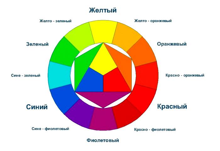
What is a color circle, and how to use it?
To begin with, we'll figure it out with the structure of the color circle shown in the illustration below. It clearly distinguishes three tiers in the direction from the center to the periphery.
The main or primary are three colors, since it is precisely all the others are drawn up - it is blue, red and yellow. They are put into the center in the form of triangles.
The result of their pairwise mixing is shown in the second tier:
- Blue with red give purple shades.
- Blue with yellow - green.
- Red with yellow - orange.

The third level of the circle shows tertiary colors that are obtained after mixing primary (red, blue and yellow) with secondary (purple, green and orange). Those colors that are obtained as a result of such mixing in different proportions, just used in the design of interiors, creating fabric patterns, in writing pictures, etc.
Not represented in the color circle, such as white, gray and black, as they are in nature in pure form simply do not exist. But when interior design, they may well be used both as basic and to create additional shades.
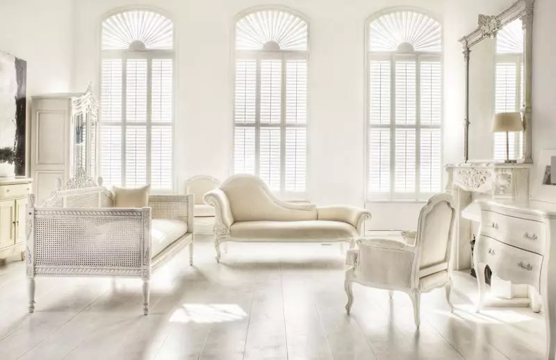
The interior is quite rarely used in large quantities. They, as a rule, can only set the total color "mood" and serve as accents in the form individual elements - It can be a chair, pillows, covered on furniture, sometimes curtains. For basic design, complex shades are used, which are the result of mixing several primary and secondary colors. They are chosen for staining of walls, gender, furniture upholstery selection, etc. These interiors like most housing masters who want to create a cozy and psychologically comfortable atmosphere in their possessions.

On the presented scheme, several options for the main combinations are shown. different flowers:
- Analog colors - These are shades created on the basis of two colors. In the example shown - red and blue, taken in different proportions. In the circle, they are located near and show the transition from warm to colder. Selecting the shades on this principle, you can take two - four different, but close to each other tertiary colors.
- Contrast colors They are located in a circle opposite each other - this is a light and dark, warm and cold shade. In the case shown in the scheme, bright yellow and purple color are taken. The contrast is most often used to create accents in "adult" interiors, and in the children, this principle may even be used as the main one.
- Complementary Triad. . In this case, two cold and warm warm and dark colorslocated in the circle also opposite it. The scheme shows that light yellow will be well combined with dark blue and purple flowers.
- Double split contrast version . The formation of this scheme is more complex and occurs in two ways:
- every third color exterior Circle;
- According to the rectangle or rhombus inscribed in the circle.
In this case, the colors that will be well combined with each other - the red color is harmonious with blue, yellow and green, blue is well combined with yellow, and sometimes green.
- Three-color scheme (triad) . In this embodiment, two harmonious shades are selected to one base color located from it through three colors in both sides of the circle.
Relying on these principles, dozens of various combinations of different shades are formed. There are also remote pairs, as well as the combined four colors among them, which expands the possibilities of selecting options.

The colors located in the circle are changed by their saturation from light to the dark. Therefore, by choosing the sector with specific colorFrom it you can pick up a few shades that differ in the tone. This combination of shades in the interior is called monochrome. To revitalize the design or underscores of certain elements in design, universal colors are used - white, gray, black, and sometimes red, depending on the selected style Direction, creating a certain mood and purpose of the room.
Tables combinations of shades
Pick up the shades of colors yourself - a rather difficult task. Therefore, it is easier to use ready-made tables created by professional designers. However, in order not to make a mistake in the selection of colors, you need to know how to use them correctly.

In the color selection tables, various shades are presented, which are harmonized between themselves and are used to design interiors. As a rule, one block is made up of five and six colors. The first color in the block is the main, second and third optional - they "support" the first. The remaining shades are accent, that is, used to revitalize the interior.
An important role in the selection of colors is played by the selected interior style. This factor will be described in more detail in a separate section of publication.
Designers divide all colors on warm and cold, it is they presented in the following table:

It should be noted that sometimes the facet between warm and cold shades is barely underwritten.
If it is decided to choose the color gamut on their own when performing cosmetic repair In an apartment or house, you need to adhere to several recommendations for the choice of warm and cold tones:
- For premises having large square And high ceilings, it is recommended to use warm shades. They will help make the room more cozy.
- If the room has small sizes, and it is desirable to expand visually, then it is necessary to arrange it in bright shades close to cold. So the room will look more spacious.
- For kitchen premises do not use dark and cold tones. For them, warm colors, increasing appetite - orange and herbal green are suitable. White color is suitable for the kitchen as an additional. He is able to remove stress from the eyes, and it will not be extensive for the modern style of high-tech, nor for the classical direction.
- When designing a bedroom, use light light pastel shadesrelaxation and relaxation. However, if the bedroom windows go to the sunny south, then the room is better to choose cold tones. If the sun is rare in the bedroom, then the comfort will be able to be warm shades.
The one who has no desire to select the desired variant of the satellite gamma in color blocks, can use the tip, which gives the following table. It presents the most used basic colors and options for additional shades that are well combined with the first, and those that are harmonized poorly with them.

The table is easy to apply, picking up the color gamut for the design of the room. It is enough to take color pencils or sit down to a computer with a graphic editor installed, and, looking into the recommendation, make your own color block. The first thing to be done is to determine the main color, and then pick up the shades harmony with it - here it is already possible to a certain extent (more precisely - in the recommended borders) to rely on your preferences.
Color range of textiles and furniture
Do not forget that when creating a color gamut of the interior, it is involved in it without exception objects and decorative elements. Therefore, not only the color of the walls, gender and ceiling, but also furniture accessories, as well as textiles - furniture upholstery, porter and decorative pillows, covered and plaid. In this case, to help beginner designers and those who independently decided to decorate their accommodation, a table-tip of furniture colors and accessories, which are well harmonized with each other. The last column in the table represents shades that are not recommended for use with a specific color of the furniture.

Effect of color on man mood
It has long been proven that colors affect the mood and, in general - to the entire psycho-emotional sphere of man. Some of them are pleased or soothe, others, on the contrary, act in oppressing, are able to annoy or cause a difficult-acting alarm. Therefore, choosing this or that light direction in the finish, it is worth carefully examining the recommendations of psychologists. This is especially important when we are talking about the design of the children's room.

This table presents the most popular in the design of the interiors of the color and their shades and are described by the emotions that they can cause.
| Illustrations with examples of interiors | Color and its influence on the mood and psyche of man. |
|---|---|
 | Red color acts on the psyche of man annoyingly, can cause a feeling of anxiety. Therefore, in its pure form, it is most often used only to introduce expression into the interior, in the form of contrasting accents. If in boring, almost monophonic interior Place a red pillow or plaid, it will immediately revive the room. However, it is not recommended to overstat the design with red. Traditional red walls are for living rooms performed in English style. |
 | Natural shades of yellow and green colors are able to raise the mood, instill calm and peace. Green shades remove fatigue with eyes, and also have to relax and relaxation. Therefore, they are well suited for decoration of bedrooms, kitchens and children's rooms. Use these colors and in those rooms whose windows overlook the north side. |
 | Pastel beige and yellow shades contribute to the creation in the room coziness, lead to mental equilibrium and cause a feeling of peace. Pastel tones are well suited, almost for all rooms, especially if their design is made in one of the classic styles. |
 | Turquoise and blue color. These shades create a feeling of freshness and ease, have tranquility and contribute to light popping. Good these colors for bedrooms and children's rooms, especially if they are located on the sunny side of the house. |
 | Orange and juicy yellow. The colors create a warm atmosphere and comfort, stimulate the active sections of the brain, raise the mood, act on the whole organism toning, increase appetite. Accordingly, the colors can be used as the main or as bright accents in children's rooms, living room, as well as in the kitchen. |
 | Dark blue color is used in conjunction with other, close to it or, on the contrary, contrasting colors - gray, blue, yellow, etc. Dark blue should not be used as the main color, since it visually reduces the room, but does not add any comfort or warmth into it. It can be applied along with the above colors and their shades in the living room or bedroom if the color corresponds to the selected shared room design. |
 | Gray and its shades can be selected as the main living room or bedroom. They balance the mood and do not cause irritation. However, if you use only gray gamut, the room will look boring and uncomfortable. Gray shades are well combined with almost all colors, so the choice of "reviving" add-ons will depend on the preference of the apartment owners, as well as from the selected interior style style. |
 | White color serves as an excellent background for any designer ideas The interior is always freshness, cleanliness, accuracy and order. However, the oversaturation of white makes a certain coldness in the interior and deprives him. |
 | Black color is able to emphasize certain interior elements and serve as an emphasis in the design of the room made in bright shades. However, this color is mainly not recommended. It may well make the premises of "sullen" and will be a gone to act on the psyche, causing fatigue and spiritual anxiety. |
Mastering the basic skills of the combination of colors can be experimenting using the main color and several additional shades. For this you have to apply fantasy and your own taste preferences. The task is simplified by the fact that now at the disposal of a user a lot of graphic applications, which even at the design stage, weighing how successful the intended option is obtained.
It should be noted that as such " proper combination Colors "- no. It will be correct to talk about well and unsuccessfully selected colors. The latter violate the harmony, bringing a permanent mess in the interior and some kind of non-accuracy.
Color design options in various combinations of shades
Next will be presented selection options. color decoration Residential premises indicating the shades used in them. Similarly, you can also create your own project for a particular interior. It takes into account the color not only stationary or applied on the wall of decorative design elements, but also plants used for registration.
First option
This interior decoration solution is compiled on contrast. The main, dominant color in the project is deep dark blue, and supports its brown color, in which some furniture accessories are made. In the contrast with them there is one of the shades of yellow - in this case, a mimosa close to natural color. This color is obtained when adding to pure yellow large number brown shade.

In addition to the main, the color range includes gray and gentle-turquoise, almost white tones that make freshness and lightness.
On the wall of the dark blue color are fixed by photo wallpaper, on which gray-turquoise shades perform. On the background drawing, mimosa branches supported by a bouquet of bids in a vase installed on the table are clearly distinguished. This combination is used to form a spatial effect. In contrast dark Walls The floor is laid light, volumetric carpet, which is added to the light and coziness into the room. Its light gray shade harmoniously echoes the background of the photo wallpaper.
The center of the composition is the chair, having a mimosa color upholstery - it attracts his eyes first. Harmony would not be complete if the designer did not use such a simple element as a decorative pillow thrown on the chair. It is present all in the interior of the color. Thus, it would seem, a minor decorative element combined all the color solution. In addition, as balancing flower accents Vases, lamp and other decorative elements complementing the interior design are used.
Second option
it decorative solution Interior design is aimed at creating a homemade cozy situation. The main dominant in this case selected a white-blue color, in which the ceiling and walls are made. Thanks to this shade of white, the room visually expands its borders.
A rich gray adds depth and comfort to the interior, it is made in it a pouf-stand for legs mounted between sofas having a white upholstery that adds massive furniture with some "weightlessness".

The bright carpet with a dark patterned pattern supports the spatial direction designed by the designer.
Despite a small amount of bright warm shades, they involuntarily overlook the fore, reviving the restrained tones and making the room cozy.
The darkest color applied to design is red-brown. It is framed and used in furniture accessories, as well as cornisses for the porter.
In general, this designer solution Cannot be called expressive. It is more likely to rest and relax.
Third option
Despite the fact that the main color in this interior is the gentle-beige, the main role in it is played by a bold combination of sufficiently bright shades of purple and herbal-green.

This color decision design can not be called soothing or pacifying. Rather, this combination of shades will cheer the bedroom owners in morning hours. However, bright shades are used only in non-stationary interior accessories - bedspread on the bed and curtains on the window. That is, they can easily be replaced with other colors, which radically change the appearance of the interior. This solution gives space for color experiments.
So, this interior, if desired, it is possible to change to restraintfully soothing, for example, using not a light purple bedspread, and its beige version, reviving design only with bright decorative pillows.
Dark brown, although it does not go to the fore, is balancing, vaccinating weight. So, it is mainly applied to furniture accessories, and only the framing of the picture on the wall in the headboard is only an exception.
Fourth option
This color solution is approximately close to a fairly popular worldwide style capable of making any room with a cozy, relaxing to rest. No wonder it was applied specifically for the decoration of the bedroom. However, this approach with success can be used for interior living room.

The main color in this color is white. The second, which supports his tint is the pastel beige, close to the cold. It has the walls of the room, as well as it is used in textiles. One of the reviving is the color of "coffee with milk" - it is applied in the design of the porter, for the framing of decorative pillows and paintings placed in the headboard.
Cold gray-blue color, although it takes a pre-first place in the table, is one of the main in this interior, as it is designed to revive it. It is used to design pillows, desktop lamp and paintings that in the complex make up a composition resembling a carpet. Without the use of framed paintings, the interior would look like, straight, empty.
A little brown in design is a bit, but he also plays his important role in it - complements the composition with dark accents. It completed some furniture accessories, as well as it is applied in small quantities in the design of frame frames.
Fifth option
A surprisingly deep combination of shades close to each other are used in this interior. However, it is made in cold colors, more suitable for rooms, windows overlook sunny side At home, otherwise the selected shades will make the room with gloomy and uncomfortable.

The main in this color solution is selected gray-blue pastel color - It has placed walls, a delicate patterned carpet and some furniture accessories. Supporting for primary color is a darker deep shade, it is applied to individual interior elements. So, the room adds the coziness knitted pouf, without which the design would be unfinished.
The most important role in the color solution is the light blue color, which enlivens and reflects the design. Dark blue, as well as black, applied in the interior for weighting of its individual areas, as well as framing elements. The comfort room gives an unusual carpet with a knitted ornamental pattern, which perfectly harmonizes with a pouf, as well as a cover on a small stool.
Sixth option
This is a selection of summer lung colors, well-appropriate for design veranda, as well as rooms. country houses. The main in this selection of the color scheme is almost white with a light blue shade - the wind frame is painted in it, which in this case are part of the interior design. This is due to the fact that in the presence of a large amount of natural light in the room there are no curtains. Similar option It is good if the windows of the verandas are in the shade of the crowns of trees, otherwise it will overheat on a hot summer day.

In this case, the color of different shades are applied to the design of various shades, thanks to which the harmony reigns in the interior, echoing with the street atmosphere. Although the main blue tint is chosen mainly in this solution, at first glance, green colors of various tones are highlighted on the furnishings of the room. Exactly green color Promotes the creation of a pacifying mood and rest eye.
The style selected to decorate the veranda is also close to "Provence", and the proof of this is a wooden boardwalk, painted in white color, selected in shades of decorative pillows, shape of the back chairs, and also window Ramaseparated by numerous jumpers.
The overall mood of this interior is ease, freshness and comfort. On such a veranda, it is nice to spend your free time for your favorite book or by tea party.
Seventh option
The choice of color gamut for the design of the living room can be called the most difficult, and it largely depends on the style in which the interior will be performed. This project presents the classics of an English style, in which the mainly selected pastel brown shade is selected - it is used to decorate the walls. For their finishing, wallpaper with a traditional style for this style is an ornamental pattern.

Supports for the main shade are chosen close to it of a darker and light tone. Light left horizontal surfaces of the room - the ceiling with a classic frame is wide ceiling plinth and floor covering. In addition, the floor is chosen a bright one-window carpet with a long pile, which makes the room lighter. He dilutes the bitch close to each other shades of juicy green splashes, as well as a blue-purple color used for the upholstery of chairs and a lamp with a large lampshade. These items are installed in the room in such a way that they balance the distribution of flowers around the room.
A refreshing interior factor is the English fireplace of white, which becomes the center of the composition, attracting his eyes.
Green accents are also designed to dilute dark deep tones. They are barely noticeable, and nevertheless play a demonstrated interior not a latter role.
Eighth option
The choice of color gamut for kitchen design is also a difficult task. It is often caused by the fact that in this room it is difficult to avoid various evaporations, high humidity, appearance on the walls of greasy spots, especially in the workspace. Therefore, for the kitchen, first of all, the materials that are easily cleaning are needed, and the colors should be so that small contaminants still do not immediately rush into the eyes.

This color design project is almost completely in warm shades. True, with the dilution of them with a small amount of cold-blooded pastel turquoise, which, at first glance, is almost impaired, but at the same time plays an important role in the interior.
The main thing in this project is called a white-gray color in which the ceiling and apron is made. working areaSimulating brick masonry. On his background it looks good hinged cabinets Colors close to coffee, but softer. Harmonies with them and peach shade used to decorate cabinets located under the table top. Thanks to him, the kitchen is filled with comfort and light.
Textile elements of the kitchen room, as well as chairs have the very light cold turquoise tint, giving the interior a special "taste" of purity and freshness.
Ninth option
Another option for designing a kitchen, radically different from the previous one with its brightness.

Although the main color in this project highlighted a white-blue shade, the main thing is the juicy turquoisein which the facade is painted everything kitchen headset. He gives the room the invigorating mood and makes bright notes into it. The apron and the rest of the wall, along which the tabletop is installed, has an interesting picture made in white-turquoise tones. This ornamental design contributes to the designer solution the necessary stake of coziness.
The main color is used for outdoor and carpetThanks to which the room looks lighter.
Yellow color is applied to create an accents in the interior, which serve objects of dishes, desktop vase, as well as other decorative and functional elements Kitchen.
Tenth option
This design of the kitchen is made with elements of the High Tech style and. They are given not only "industrial" color solution, but also details like imitation brick wall, Metallized surfaces or shades close to them.

As you can see from the color scheme, the first place is supplied exactly the steel color, in which the facade of the kitchen headset is made, which is well released against the brick wall of a darker, but also a steel shade.
The dining table is made of two materials corresponding to the styles called above - metal and glass. Chairs shown in the project intentionally have different configuration and made in different stylesWhat is characteristic of the "Loft" for which the furniture items are collected.
Flooring is made in black, against which steel shades are well released. In addition, such a color is driving the "lower tier" of the interior, making it more solid.
An emphasis in gray-blue metallized design is a bright raspberry color, which makes the interior warmer and interesting.
This color solution is not like everyone to do, as it looks somewhat gloomy. However, it is quite possible to revive, adding contrasting colors. Fless that the main shades are well combined with almost practically any bright spraces.
* * * * * * *
Now, knowing what to rely on when developing your own project, you can experiment, reaching several options performed in different color gamma. With this approach, it will be easier to avoid mistakes and get in the end exactly what you like and the most developer, and all members of his family.
Complete the publication of a video selection of interiors, which demonstrates a lot and successful, and not very, but in any case - interesting variants of the combination of colors. Perhaps it will tell the reader and some kind of own idea.
Video: Combination of colors in the interiors
Most people intuitively feel a harmonious combination of shades of different colors. Only a little anyway, if in the room with pink Walls There is a green poisonous. Most likely, these people suffer impaired vision. A good color combination speaks about the taste of the owner of the tenant and, in many ways, about his character. , It is necessary to think carefully. A table combination of colors in the interior and knowledge of some design secrets, which are more detailed in this material.
Color Harmony - Pledge successful interior
The main colors are seven, these are the colors of the rainbow. In smooth transitions and shades, only liquid crystal screens are able to reproduce sixteen million colors, and the human perception is available at one and a half two times more. Here you can get confused, how to be? How to choose from such a gigantic palette with successful combinations and what should be avoided? It turns out everything is not so difficult.

Psychologists are not reasonable to argue that the color scheme is able to influence the mental and even physical health of the person. The east scientists have successfully practiced the pains of patients with severe diseases.
The tones that you pick up the room design must match your character. For example, - personifies spirituality and confidence.
But the red is shown to people with blood problems. It contributes to an increase in the number of red blood cells.

Conclusion one - you should not bet only on one color gamut. It is necessary to create a harmonious color combination, which is beneficial on the nervous system and well-being.
Types of color
All varieties of colors in nature is divided into three subgroups:
- basic - blue, red and yellow;
- secondary - the result of mixing primary colors: green, orange and similar to it;
- tertiary - the result of mixing secondary and primary colors, for example, emerald.
But the white and black are conditionally not considered to be color, as they are not found in natural conditions.

All segments of the circle can be divided into warm and cold shades. It is believed that the combination of shades of one "temperature" is ideal.
Another option selection combination is to carry out diagonal lines. Here it will turn out, as they say the unity of opposites.
Color-colored color palette and some important principles
There are several combination options.
| Monochrome |  | Use of different shades of the same color. For example, pink - from hot to pale. |
| Achromatic |  | Registration in black and white colors or black and white. The option is not complicated, but for the interior is quite boring. |
| Complementary |  | The use of contrasts, sometimes unexpected, but combined. For example, yellow and purple. |
The black and white gray gamma in the interior should be diluted by some kind.

Light pastel shades Cold "Temperature" can visually increase.
Using contrast tandems in the design, you should choose one basic tone and pick up other shades to it. When the selection should not be too carried away. Too many colors will make the interior in Gypsy Penter. While this option is not in trend.
There are shades that do not tolerate neighborhood. Do not merge dark hot tones and light cold. For example, Dark Bordeaux and. Such tandems may adversely affect the psyche of the inhabitant of the room.

Examples of combinations in the interior
Using the colors of different temperatures and contrasting combinations, you can control mood and wellness, create a working or romantic atmosphere, a feeling of comfort and comfort. Consider examples of a photo of a combination of colors in the interiors of different rooms.
Children's room: Everything for the development of the kid
There is an opinion that everything should be bright and fun. It is not so, or not quite so. It is necessary to approach the color chooser very responsibly, given the characteristics of the child.

Yellow tones will help to focus on classes, green will reassure forth, the blue will grow up the dreamer, and in the blue room, the younger family member will feel lonely, especially if he has no sister or brother.

About the combination of colors in the kitchen interior: photo of appetizing options
A successful combination of colors in should awaken appetite. In the photo the very following successful combinations:

 Classic pastel tones - universal option

Great mood And all the shades of orange, yellow and green are promoted by an increased appetite. For comfort, it is worth adding red and blue, beige. But too saturated tones can cause the opposite effect - to beat off the appetite.
Caution with the living room
- The place in which is going, as a rule, the whole family and guests. Here it is not necessary to select colors not under individual preferences, but rather universal shades that will not cause discomfort. For this reason, the living room use neutral soft tones, in bright shades.

Personal Space: Bedroom
In combinations of colors in manifests the character of its owner. Here you can use your favorite paints, even if you suffer the desire for the black. But it should be remembered that in too dark or bright it will be difficult to create a relaxing atmosphere.

Combining shades on an example of wenge
- A relatively new shade in our interiors, but every year it conquers increasingly popular. By the way, Wenge is the breed of tropical wood. Its classic shades are notching dark chocolate. Let us consider successful combinations and photos in the interior.

This shade is successfully combined with:
- all shades of milk, sandy and beige;
- blond pink and gray tones;
- orange.

Any of the combinations mentioned above should be supplemented with bright notes: turquoise, red or noble burgundy.
Wenge can be used in different versions:
- In this tone, it looks expensive, as in the aristocratic castle. It will be appropriate to pick up, they will harmoniously complement the kit.
- Colors of Wenge - today the most popular product in many manufacturers. Such or dressers usually do not contain an excess decor.

- In Tonah, Wenge is already considered a classic. It gives the room a noble appearance. Here, in combination, you can use stained glass windows.
- If Wenge is present on the walls of the room, you should select light furniture, which will be worthy of looking on this background.
The only place where you should not get involved in this color -. As a rule, the area of \u200b\u200bthis room is not large, and the shades of dark brown will make it visually even less.
On errors learn
It is more profitable, of course, learn from other errors, so let's consider the most common flashes that allow homegrown designers:
| White white | Single white color of the room cattons boredom. Considering that white combines with any color, add bright accessories, the mood will immediately change. |
| Walls of different colors | Room zoning with different use |
I recently resumed my lessons on drawing and painting, and I want to tell you about a combination of colors. In any situation, when it comes to color, there are successful and unsuccessful combinations of shades. Whether it is a manicure or clothes, drawn postcard or even the repair of the house - it is always important to choose a beautiful and interesting combination of colors.
With regard to clothing, it is even more important if you can paint the house and your favorite bedroom to some kind of shades, and to invite only close toes there, then the clothes are the most important social tool that allows us to make the first opinion about each other, and therefore it is impossible to allow Your clothes spoke about you wrong. How to choose good shades and pick up interesting couples? What rules on this account? How to pick up any tone with glitter?
A bit of theory
The easiest way to choose a suitable shade is to use the color circle. It is divided into 12 sectors, and it presents the main colors. Also, each sector is graded from the light (in the center) to the dark (along the edge). What can we withdraw from this circle?- White harmonizes absolutely with any tone and makes it brighter.
- Black will help dilute any ensemble and at the same time will give him depth.
- Complete complementary and similar color neighborhoods.
- You can withdraw triads, tetrads and squares.

This is a good combination, and most often they use many lines of clothing - they produce the same models in complementary shades, and then buying a purple blouse you can always choose a pistachio skirt to it (and vice versa).
Similar couple - Those that stand next to the color circle. Such couples are often found in architectural compositions. Surely you saw when the house was painted in a light lemon, and architectural elements - Sucks and eaves, balustrades and architezes are green. It is also found that this solution is very often in accessories - for example, it is much easier to find yellow shoes with orange finish than yellow with blue or purple.

Triads, tetrads and squares - schemes that are derived from a special form in a color circle. For the triad, this is a triangle, for the tetrad - a rectangle, and the square says for himself.

Look at different color circles to understand the principle, and you will never be mistaken in choosing a good shade.


Neutral
Neutral colors are called black, white and gray - they are suitable almost to everything, and look good together. However, it should be taken into account that man, from head to the legs dressed in black or gray - movietone, monochrome outfits have long become a sign of bad taste. In the summer it is appropriate to be dressed in white from head to feet, but here to save brightness can help accessories - bag, shoes, bright decorations and details.Any combination gray It should be well balanced. As a rule, on sale rarely there are fabrics or accessories of a pure gray shade, most often the color has a cold or warm subton. Accordingly, picking up a combination of colors with gray, you need to watch:
- on gray heat;
- on the warmth of the selected colora;
- on the light of two shades and their compatibility.
Heat gray
Gray can be warm and cold.
Warm shades are better to combine with warm tones - yellow, orange, red, pink, crimson.
Cold gray looks perfectly if you add blue, lilac, green or blue to it.
The warmth of the selected color
Even yellow can be cold. It is best to choose those paints whose temperature corresponds to the main temperature of the colora. Warm yellow and cold blue look well with cold gray.Svetlota
This place that the selected color could take stretching from the very dark to the brief itself. Best of all, if gray does not compete with your partner. Can't choose? Choose the brightest shades or pastel colors, and it is better to refrain from dark.


Warm
Warm colors on a color circle are represented from yellow to violet. This is a pleasant gamma that raises the mood and gives the feeling of warmth and light. However, choose color couples It is not so simple. Naturally, when I'm talking about the neighbors of red or yellow - these are the combinations, where the color specified by me is the main one (that is, visually prevails).


The best combination of red - with white, blue and black. These are pure shades that worn kings and queens, this gamma (without black) is represented on Russian tricolor and flags of other states. Use clean shades, and then you will definitely be confident in your choice.
Interesting is a combination of burgundy color with shades of blue and gray. In general, any berry tone is suitable for burgundy. But the green tones are better to choose with a cold subtock.

Beautiful combination brown color With Beige - it turns out a pleasant chocolate combination. Shades of cocoa and coffee, tea and milk, baking and ivory - Many combinations of colors with brown seek thoughts about desserts.

Naturally, warm tones are perfectly combined with each other - brown and light orange look great together, and the combination of red, orange and yellow was once ultra-fashionable.
Want to add to the combination of the highlight? Try complex tones. Combine brown with plum, beige and blackberry, warm ink and cold turquoise. Yes, do not forget about the combination of brown and mint color. The combination of mint and chocolate brings thoughts about the entertainment, pleasures and rest.

Like extravagant? Add a bit of deep shade accessories - for example, cobalt blue is well offenten orange or pink, and turquoise color looks good on the shades of yellow and green.
Cold
Cold colors are those that from green to purple. These are shades of grass and water, cool and refreshing, they bring peace and pacification. If you want to use cold shades in the interior, it is best to give preference to bright pure paints, the combination of which is very high with other colors.


Best combination For the house - dark blue with white and red. Moreover, the red should be a highlight, it should not be much, but the blue is better not to save.
My favorite shade is Turquoise, it is also called turquoise and beloved Tiffany. Turquoise color is well combined with the most different shades. You can pick up a warm pink and rich orange, which can be beautifully rejected by turquoise color. An interesting combination of turquoise shade is obtained with coral - the red-red palette emphasizes turquoise color.


It is also worth trying a combination of blue with a cold yellow and light green gamut, and the green tones will help the blue. In general, the combination of green with yellow and blue is classic for spring and spring holidays, so try to find your solutions in this color scheme (and do not forget to look at the color circle).

Try to pay more attention to the combination of green with other colors - this year, Panton announced the Greenery with a tint of 2017, so sin does not get a couple of green garardo objects and do not buy home several emerald decorations. By the way, beautiful combination Colors with green can pick up online - the color palette will be automatically.

Want to make interesting combinations purple color? Try bright cold tones - lilac, pink, green. Do not like deep purple? Try purple and lavender, and also do not forget about the lilac.
Different ideas


Can't figure out in combination yellow color With other colors? Look at the original and classic schemes of combined shades.


Cool combination of yellow and lilac with purple, combination pink colour With yellow - such a combination of lilac and yellow with purple will be remembered absolutely to everyone.


In search of beautiful brown-based schemes with others? Save yourself these schemes - if the table is always at hand, you can choose all the tones to brown.
Remember that combination orange color With black - hot and roast!
But schemes on a combination of pink color with other shades and red with other colors.


Want to make a palette in the cold gamma? Then combinations lilac color With cold tones - blue, emerald, blue and gray at your service.
Now you know about the color combinations almost a lot, like professional artists, which means that you exactly get to choose any combination of colors - at least for the perfect wardrobe, even for excellent repair!
Send the material to you on E-mail
The choice of the right color palette is essential when designing any room. Here we will talk about the ways of combining colors in the interior and about the effect of color on the mood of a person. Also let's see how the color combination table can help in the interior in independent planning Room design.
Color gamma is an important component of any interior.
It is necessary to know not only the values \u200b\u200bof each shade, the ability to competently combine tones is important. For the use of optimal color combinations The interior uses a color circle and designer table.

Before learn about the options for combining shades, let's learn about their values \u200b\u200bin our lives. As psychologists believe, they can influence our mood and even emotional state.
The color that gives the cheerful mood and heats the warmth - yellow. The color of cheerfulness, freshness and health is considered green. Lilac tones symbolize the update, and the blue has soothing properties. Orange is ideal for the living room, as symbolizes joy and vigor.
You should not use a significant number of brown tones when the room is cleaned, only in combination with others, as it causes depression. Do not abuse and red, which acts exciting. Light gray tones are suitable for the cabinet, as they indicate the collence and rigor.
Designers are presented and formulated several concepts associated with combinations of shades. The table located here is created taking into account the standard views on the use of the palette.

You can use the following combinations:
- red shades look with white, golden and with completely dark tones;
- pink can be used with coffee, reddish and chocolate;
- beige is perfectly combined with lettuce colors, as well as pink;
- yellow looks with white and green-brown;
- to burgundy will suit red, beige or golden;
- you can choose purple, white or blue;
- brown is complemented by green, blue and beige.

Working on the decision, do not forget about the incompatible colors. Do not look black with purple, such a tandem only visually reduces the space. Briefly combine burgundy with dark green. You can not use gray with orange and green. A dairy and beige shade is not suitable for black.
Helpful information! Colors Companions from the table must be selected individually in each case.
What is a color circle?
In addition to the color combination table in the interior, the color circle is applied. With it, the most suitable solutions are selected. The scheme is divided into two components - cold and warm. The latter option includes such shades as yellow, brick or orange. And the cold part is blue, purple and green.

Color color palette: options for interesting combinations
The table allows you to reveal what color combinations can be used in the interior. Photo original methods Presented on the site. Special attention The ratio between coloring components and shades should be given.

Combination of colors in the kitchen interior: photo of stylish ideas
IN kitchen zone Will, by the way saturated, deep and colorful shades. Interesting option Yellow-blue palette in the marine style. Cold gamma relaxes, reduces appetite and gives freshness. A warm color palette stimulates digestive systems, increases appetite and burte.

When choosing a palette for the kitchen, the achromatic interiors are infrequently used. This is gray, white and black. Such an option can be smoothed as a juicy accent.

In chromatic designs, the palette is a combination of several shades. First you need to find out the base tone, and then think about the suitable surroundings of the shades. For the kitchen you can offer the following options:
- single color combinations involve the use of shades in one color scheme. All effects are produced by a varied intensity of the selected tone. To create a monochrome setting, select the color and select three tones to it. Acrossments with contrast are used to revitalize one-picture design;
- the adjacent gamma is combining two or more colors, which are located next to the color circle. For example, green and bluish, yellow and orange;
- the contrast scheme involves the use of combinations of opposite to the color spectrum of the tones. It can be green and yellow. In this interior, the contrast should be smoothed by softer tones;
- the three-color interior involves the use of three shades that are at an equal distance in the color circle.

Harmonious combination of colors in the living room
The living room colors are chosen based on the preference preferences. The main thing is to respect the harmonious combination of colors.

Preference should be given to those options for design, which correspond to certain parameters:
- the monochrome combination looks well. This does not mean that the interior will be boring. After all, more than 40 shades can be distinguished in one color. For example, a wenge color in the interior is used for furniture and a combination of pink to violet is used. Similar design can be seen in the photo;

- it looks good in three colors;

- to choose colors in a color circle, impose an equilateral triangle on the circle, and you will see a suitable solution;
- you can arrange a room in light Tones. A mint tone is suitable, shade of vanilla or sandy.

Helpful information! Terracotta shades are considered joyful and sunny. This color palette includes brown, carrot, brick and dark yellow tones.
What color palette is suitable in the bedroom?
Working on the combination of colors in the bedroom interior, consider that you cannot use more than seven shades. The optimal option is the choice of two basic shades, for example, for floors and walls, and all other items are selected by tone, but may be darker or lighter.You can choose classic design For bedroom. At the same time, coffee, beige and dairy tones are used.

Terracotta, white and gray shades are suitable for style. For setting up a bedroom in mediterranean style Burizovaya, blue, sandy and yellow shades are suitable. Provence style involves the use of pink, green, blue and gray shades.

Color is a powerful tool in creating comfort. Beautiful interiors are unthinkable without a harmonious combination of shades. How to choose a palette so that you feel comfortable, could relax after a busy day, and in the morning wake up, fulfilled forces?
How to determine the color?
There are many different theories as to which paint use for certain premises. At the same time, you decide, in what color scheme you better feel.
For example, there are people who love their homes decorated in black and red and white gamme. And on some, this combination is negative, because it increases blood pressure and provokes the emission of adrenaline.
The first question that designer sets its customers, sounds like this: "What is your favorite color?" And if the family members cannot come to a common opinion, the specialist tries to make friends favorite shades in a single combination and find compromises that arrange customers.
How to understand what color do you like more than many others? Simply select any image that is nice for your eyes. With special services, for example, Bighugelabs, you can define the palette of each image and photography.
At the same time, the program mixes shades and issued an average result of three or five tones. Accents you can see on the source picture and use these colors in the interior.
If you did not find anything suitable, you can use the color circle. Online services It seems to colorscheme help to choose harmonious combinations for monochrome, contrasting and accent palettes. At the same time, you can change the degree of lightness of the main tone, dimming or lightening it.
Important! In order for the interior to look professional, it is necessary that the main color occupies at least 65% of the entire space. The remaining 35% is distributed to additional shades. And about 5% of space is given to accents.

For example, if your main color is chocolate, and you want to use 5 different colors, then 65% will take the main tone.

In our case, he will have to the sofa, a wardrobe and chair. A companion to it will be a gentle turquoise on the walls. And as an accent, use orange pillows and curtains. At the same time, gentle iris in the form of parquet will appear on the floor. A cherry on the cake will be a mint or mustard greens in the form of a nonsense bouquet.
Style and color
For each style is characterized by its palette, from which you should not retreat. Making, for example, neon paints in classic interiorYou will get a kitsch on the verge of a beamless.
Physiologically, a person estimates the environment as safe and stable when the darker shade is under his feet, the middle tone at the level of the eyes, and the heavenly white shades extend above the head.


However, modern interiors It is suggested that the designers love to stitch and turn everything from their heads. Therefore, we can meet chocolate and even black stretch ceilings over beige and white floors.
So, in front of you the style of styles and color gamuts.
| Color | Style | Combination with other colors | Suitable for: | Features |
| White | Modern, classic, modern | Everything | All rooms | Adds air and increases space |
| Grey | Provence, Country, Classic | Yellow, Green, Red, Orange, Black, White, Purple | Cabinet, Living room, Teenager, Kitchen | Neutral color. Suitable for a relaxing time |
| The black | Art Deco, Hai Tech, Modern, Loft, Minimalism | Purple, white, gold, red, orange | Large living room | Visually reduces space, associated with luxury |
| Red | Modern, Hai Tech, Minimalism, Classic, Art Deco | White, Brown, Purple, Gray, Orange | Living room, kitchen | Activates the visual nerve |
| Orange | Modern, Provence, minimalism, modern | Beige, black, white, blue, green, red | Living room, kitchen | Excites appetite, associated with oranges |
| Yellow | Modern, minimalism, Provence | White, Gray, Purple, Brown, Black, Red, Blue | Spacious living room, Children's room | Reminds summer, the sun, raises the mood. Often used for accent. |
| Green | Classic, Country, Modern | Beige, Brown, White, Gray, Yellow | Kitchen living room, room, children's, kitchen, bathroom | Adds freshness to the interior |
| Pink | Modern, Classic, Shebbi Chic, Country | Black, Red, Purple, White, Gray | Children's for girls, living room, kitchen | Pastel pink soothes, bright tires |
| Blue | Classic, High Tech, Country, Loft | White, Green, Red, Gray, Brown, Yellow, Black | Large living room, Children's, Kitchen, Bathroom, Toilet, Apartment Studio | Adds solidity and at the same time calm. Personifies originality and practicality. |
| Purple | Hai Tech, Classic, Loft | White, Pink, Green, Yellow, Black, Blue | Studio Apartment, Bathroom, Living room, Kitchen, Children's, Bedroom | Associated with lilac, spring shades |
| Brown | Modern, Country, Provence, Classic | White, Red, Green, Gray, Violet, Yellow, Black, Orange, Beige | Living room, Kitchen, Bedroom, Corridor, Bathroom, Cabinet | Creates a home atmosphere, adds comfort and warmth |
If you follow the recommendations of designers and use color palettes, accordingly, style, you will always win. Use the color circle in situations when you doubt the choice of one or another interior element. And it is better to trust the Wizards to create a project. In this case, your home is guaranteed to be decorated with taste and in full compliance with the selected style.

Color selection rules for floors, walls, furniture and ceiling
So, we figured out what color with what is combined. Next, we will focus on objects that are present in each room, we will understand in the principles of using certain shades.
Floor
There are several unwashed rules that should be considered when choosing a floor color solution.
Light floor:
- Increases space.
- He is a reflective web.
- You can use with a bright shade of walls.
- Suitable for bedroom, bathroom, toilet, living room

Dark floor:
- Combined as SO light walls, ceiling, and dark. But there must be at least 1 tone darker.
- Suitable for any room.
- On his background, bright accents look good, if there is good lighting
- Bad combined with a dark door.


Walls
Walls can be made absolutely in any color. Depending on the purpose of the premises used, it can be active, passive or neutral.

Active colors are an accent. Combined either with opposite bright color or less bright, calm.


The popular solution is the wall pastel tones. Play the role of the background of the main view of the room. In this case, you can use any floor, furniture, ceiling. Since this is a universal option.
Ceiling
The ceiling is most often choosing white or bright shades. Since it is universal color and combined with any furniture, ceiling, floor. May be matte or glossy. If you want to add contrasts, it is better to add the saturated color of the walls or interior items. You can use in any room.

If the choice fell on the dark ceiling, then it is worth considering several nuances:
- Black ceiling can only be done on a large space with high ceilings. Minimum height 3 meters.
- Combined only with white and light furniture and dairy walls, floor, furniture
- Minimalism style is suitable
- Create an effect of high costs in a room with panoramic windows

Furniture
Choosing the color of furniture Remember about 2 basic principles:
- She must be darker walls
- Light floor


9 successful color combinations in the interior of the apartment