The combination of colors in interior design. Cool cheat sheet for color combinations Harmonious color combinations in the living room interior
Good afternoon, dear readers of the blog site. Today I want to continue the topic about in interior design and this time we will talk about contrasting and harmonious pairs. As we already know from the previous material, achromatic white, black and gray are actually not considered colors, but natural browns and beige shades walls, floors and pieces of furniture in the design of rooms are considered to be neutral. White often forms the basis of the interior, as it is a wonderful background and binding for any colors and at the same time visually enlarges the space of the room, filling it with purity and freshness.
In nature, there are no incompatible colors, in all the variety of shades that the human eye catches, there are many suitable pairs, the main thing is to be able to recognize them and then combine them in the right proportions.
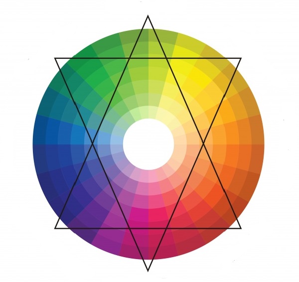
The easiest way to understand the color scheme and principles of harmonious combinations is with the help of Itten's circle, which is used by artists and designers around the world. It is based on the triangle of the classic triad: blue, yellow and red, from the mixing of which the entire known color palette is born. So, from the combination of equal shares of blue and yellow, green color, yellow with red - orange, red with blue - violet. This triad is called secondary. From the fusion of adjacent secondary and primary colors, six tertiary colors are formed, and so on. To understand the basics, the twelve-color circle will be enough for us.
Opposing contrasting pairs
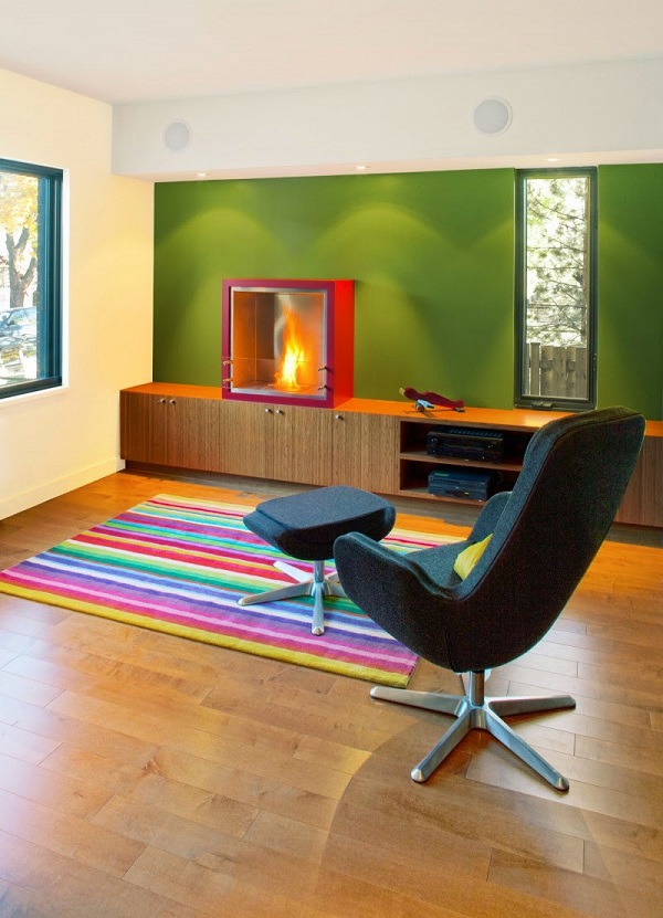
Each color on the circle has its own antipode, located exactly opposite. For red it is green, for yellow it is purple, for blue it is orange. Such pairs are called complementary or complementary. They form the greatest contrast, excite the eye with their expressiveness. These colors look very interesting in the interior, although they must be used with great care. It is not recommended to take both colors in equal proportions or mix them in pure form without neutral thinners (white or gray). The best effect can be achieved if they are not used for walls, but in textiles and furniture upholstery. In the photo below good example how to use a pair of "yellow and purple" to create bright design living room.

Itten's circle helps determine which colors are cool and which are warm. Divide it into equal parts by drawing a vertical line through the yellow one. Everything that appears in the segment with red is warm, with blue - cold. As you can see, the colors in complementary pairs are directly opposite in their effect. To make the interior warmer or cooler, it is necessary to enhance the proportion of color with appropriate characteristics.


Green color differs from the rest in that it cannot be called either warm or cold, it all depends on what color it appears in a pair with. Its opposite is red, the strongest in the circle in terms of its emotionality. Against the background of green, red is highlighted and intensified. This very expressive couple is able to transform the most boring interior, the main thing is to keep the proportions correctly so as not to make it too bright and annoying.

Extremely distant contrasting color pairs
Interiors created on the basis of complimentary colors seem too bright and even annoying to many, especially when they use the most saturated shades. There is a way to soften their interaction a little without breaking the successful connection. To do this, not the opposite color is taken as complementary to the main color on the circle, but its neighbor to the right or left. Such pairs are called extremely distant.

From such unions, such combinations are obtained as red and light green, blue and yellow, turquoise and orange, yellow and lilac. Here are some photos with examples of interiors created on the basis of extremely distant pairs.


To select combinations of complementary and extremely distant contrasting pairs, you can use such a circle of six sectors. Any opposite colors on it should match well with each other.

Related harmonious couples
Contrasting color pairs are the most vibrant and expressive in interior design. In addition to them, there are related or harmonious couples, among which you can find no less successful combinations.
Related colors are found on adjacent segments of the circle. These are pairs such as yellow and lime, purple and pink, green and blue. At first glance, not all combinations will seem successful, but you will quickly be convinced of the opposite, if you carefully examine the entire palette of shades of each sector from pale pastel to extremely saturated.


Today we continued our study of successful color combinations in the interior and looked at contrasting and harmonious pairs. Most often, they are quite enough to create a beautiful design, but in some cases triads allow you to achieve better result... We will talk about them next time. I hope this material was interesting and useful for you!
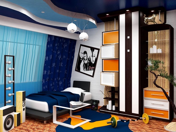
Designing any space starts with color. Determining with general style premises, the designer already presents it in certain colors, since it is they who direct the fantasy in the right direction. The combination of colors in interior design is one of the factors that indicate the style and theme of the room. Country style is dominated by noble saturated tones, all shades of wood, white, beige, burgundy, brown. To create the style "Provence" are used pastel colors with a slight splash of dark shades. The nautical style is indicated by blue, white, gray, light blue and dark wood. The classic is characterized by a wide range of beige, chocolate, coffee. The ethnic style plays with contrasts, using brown, bardo, black, red. The choice of color solutions is critical stage, on which the success of interior decoration as a whole depends.
The joke that all men can only distinguish 16 colors, as in the default Windows settings, has real roots: there are many more "color-sensitive" cells in a woman's eye.
However, studies show that the human eye is able to perceive a huge number of colors and their shades: about 250 pure and more than 10 million mixed.
A simple understanding of the colors of the main spectrum will help not to get lost with such a variety.
There are only seven of them: red, orange, yellow, green, blue, blue, purple. Taking these colors as a basis, diluting them or mixing them with each other, colorists create a huge number of tones and shades for use in the interior. To them are added the so-called achromatic colors, that is, they do not carry any color load. There are only three of them: black, white, gray.
All colors can be roughly divided into two groups: warm and cold:
The feeling of warmth is caused by red, orange, yellow, and their various shades. Warm colors are used to make a room feel more comfortable, to add light to a poorly lit room, and to correct too much empty space.
The feeling of coolness is evoked by blue, purple, blue and their various tones. Cold colors are suitable for well-lit rooms, visually expand the space, give freshness and vigor.
How to choose the right combination of colors in interior design?
The choice of colors and their combinations is a complex process that sometimes baffles even professional designers. But with a versatile, easy-to-use color wheel, anyone can now match colors correctly. You just need to remember that inside one room you should combine from three to five colors, no more.
Color circle
1) Several shades of the same color
This is a proven and reliable way for calm natures who do not like to take risks too much. The room is "filled" with all sorts of shades of the same color: from the deepest, saturated to the lightest, barely discernible. Smooth transitions and a guaranteed successful combination will give the interior tranquility, harmony, and tranquility.
2) Playing on contrasts
The method is radically opposite to the previous one. Two contrasting colors are taken as a basis, located on the color wheel opposite each other. Contrasts are played up in the interior using neutral colors such as black, white, gray.
3) Harmonious combinations
One of the colors in which I would like to decorate the room is taken as a basis. Two more are "attached" to it, located to the left and right of it on the color wheel. In this case, the colors will form an original and beautiful combination, without abrupt transitions.
4) Three spectacular colors
A slightly more daring move, but without unnecessary flashiness. A triangle is used to identify three well-combined colors. It can be rotated within the circle until the angles indicate the most pleasing combination for each individual case.
Color matching rules for different rooms
The influence of color on a person's mood and emotions has not been a discovery for a long time. That is why you should very carefully select colors for interior decoration, depending on the purpose of the room.
Bedroom
It is not recommended to decorate the bedroom with sharp contrasting tones, as this place is designed to relax and calm. Pastel colors, soft shades are perfect here. Warm colors are preferable, but cool tones can be used if the room is small and the windows face south. Competently selected accessories, the addition of white, and the correct placement of accents will help to bring coziness to cold tones.
Living room
In the interior of the living room, you can be bolder with a choice of colors. Playing with contrasts or using catchy accents will add vigor and give the interior a stylish, spectacular look. If the windows face north, it is worth taking warm shades as the basis for the interior. If the living room is too small, you can "expand" it a little by applying a light cold palette. It is important to consider that cold colors are only good for bright rooms where the sun does not leave the room for a long time.

Thinking over the design of the room in detail, you should pay Special attention color scheme. Successful combination colors in the interior will cheer you up when you return home. Eye-pleasing shades will allow you to relax after a hard day and enjoy your rest.
The color scheme of the home furnishings creates a certain atmosphere in the house. Strict tones finishing materials in the office they tune in to work and help to concentrate. Pastel shades the bedroom is conducive to relaxation. The combination of colors indicates the tastes and preferences of the owners. How to choose the right harmonious combination? 
Color wheel concept
The correct color combination can be found using the color wheel. The color wheel contains the colors of the light spectrum. It is based on Itten's color wheel. The artist Itten selected 12 colors and placed them so that the contrasting tones were opposite each other.
The colors of the light spectrum can be obtained by combining in equal proportions three primary colors: red, blue and yellow. 
The result is secondary shades. When a primary color is mixed with an adjacent secondary color, a tertiary tone is formed. The resulting combinations (secondary and tertiary), together with the primary ones, form a circle of 12 sectors. The gamut of the color wheel can be increased by including countless shades and tones of the primary colors. 
How do you find the right combination?
Finding the right combinations:
- Analog color scheme interior design contains a rich base color and its shades. On the color wheel, they are located side by side;
- Colors in the interior are well combined, related to the same temperature. Blue, green and purple, as well as their shades, belong to the cold range. Red, brown and yellow together with undertones make up a warm palette. Cold and warm colors divide the circle in half. Black, gray and white are neutral tones. Pick up optimal combination the table of color combinations in the interior will help;
- You can use contrasting colors in the design of the apartment. On the color wheel, they are opposite each other. In this case, one shade should be bright and saturated, and the other (complementary) more calm. The combination of light green with purple looks beautiful in the interior of the apartment, the photo of which is presented below;
- Contrasting combinations you can make it softer if you take its shades instead of a complementary color;
- A triadic scheme involves a combination of three shades located in the color wheel at an equal distance from each other;
- Any combination of colors in the interior can be complemented with neutral shades. They will help to place accents, highlight focus on specific areas;
- Two different colors complement the overall undertone to each of them. The table will help you choose a combination of colors in the interior. For example, blue and green will look harmonious when combined with turquoise;
- The rectangular scheme allows you to use 4 complementary colors in the interior of an apartment or house (2 cold and 2 warm). The square scheme contains 4 shades equidistant from each other;
- A small interior detail in bright or exotic colors looks very impressive against a neutral background. The monochrome interior will be decorated with a coral chandelier. The purple armchair looks original and stylish in a room decorated in black and white.
 Interior design recommendations
It is better to use no more than 3 shades to create a color combination. The basic background should prevail on the finishing materials of the walls, ceiling and floor. Background tones are used for furnishings.
Up to 75% of coatings and finishing materials should be in the base shade. Minor tones occupy 20% of the surfaces. The remaining 5% is used for color accents... Some designers recommend 60-30-10 color matching. 
It is better to use softer tones as a base shade. Saturated, bright and contrasting shades should be present on furniture and accessories. If you want to choose 2 contrasting colors that do not match with each other, you should supplement them with a neutral option. It will provide a smooth transition from one color to another and make the combination harmonious. A bright and rich base background is complemented by secondary calm or neutral shades. 
It will give the room a bold accent in an unusual place. Can be painted in bright color radiator or windowsill. A small black detail (lampshade or picture frame) will enhance the brightness of the interior colors and give the room solidity. It is correct to give preference to pure tones, avoiding dull and vague shades. 
Characteristics of the main colors
Green is suitable for any environment. It helps to relax and calm down. Recommended for decorating bedrooms and bathrooms.
Red is better for highlighting small details. Its abundance visually reduces the room and acts annoyingly. Red is perfect for a dining room. It has the ability to improve appetite. 
Cheerful warm yellow is often used to decorate children's rooms. It boosts creativity and improves brain performance.
Blue has the ability to relieve stress. It has a calming and relaxing effect. Ideal for the bedroom. It is recommended to use it in small quantities. It will highlight the design style. The predominance of blue will make the room uncomfortable.
Royal purple will add solemnity to the living room. It can also be used for dining. It is recommended to combine purple with pastel pink or light green. Its combination with blue and lilac looks good. The selection of a combination of purple and gold will make the living room luxurious. A large number of purple and its shades have a depressing effect on the psyche. 
Brown and its shades are the most popular in interior design. This color scheme is associated with warmth, coziness, comfort and relaxation. Used in all rooms. However, the abundance of brown and its shades narrows the space.
Noble gray visually expands the space. It is a great backdrop for colorful accessories. Gray and its shades must be diluted with other colors, otherwise the room will look dull and boring. It is not recommended to paint the ceiling gray: the room will look depressing. 
Black can only be used in small dosages for contrast or color separation. Going over black can make a room look gloomy.
Blue is not recommended for use in the office and for decoration of rooms in which schoolchildren study. It reduces performance and brain activity. Do not use it to paint the floor. The surface will appear unstable and slippery. V blue tones it is recommended to arrange a dining room for those who seek to lose weight. 
Practical use of the color palette
The combination of colors in the interior will help to change general form premises. By combining light and dark shades, you can visually lengthen, expand or narrow the room, as well as make it lighter and taller.
Visually make the ceilings higher light shades in the upper part of the room. A bright contrasting color will help to expand the room, in which narrow walls should be painted. Dark and rich shades will hide the unevenness of the walls. Ideally flat surfaces will emphasize light tones. 
Align the corners with 2 contrasting colors or a combination of a bright shade and its lighter tone. They are connected along a perfectly flat line drawn on one of the walls near the corner.
Increasing the space of the room is achieved by blurring the boundaries. You can achieve this effect if you paint the ceiling and the upper part of the walls (30-40 cm) in the same color. The room will appear larger if you apply contrasting tones (saturated color and its light tone). The two remaining walls are covered with the same colors in the form of alternating stripes. 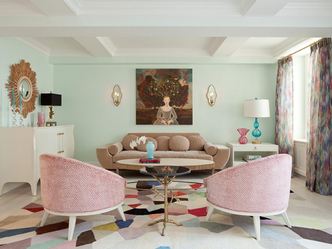
The alternation of stripes of bright shades will visually stretch the room up and make it narrower.
A palette of warm colors is ideal for dark and cold rooms. The selection of cold tones will make the room less light and warm.
You need to combine colors in the interior, guided by your preferences, without being afraid to experiment. If you cannot find the desired combination in any way, it is recommended to distract yourself for a while and walk around the house. You should imagine the future design in detail. You can paint large sheets of paper in the desired colors and attach them to walls and furniture. This will help determine which color is best for your kitchen or bedroom. 
Color combinations in the interior must be carefully considered before performing renovation works... If the decor does not meet expectations, it will be much more difficult to change it.
Photo gallery
In our gallery you can view 59 more interesting options literate color combination in the interior.
Click Class
Tell VK
The combination of colors in the interior allows you to make the room harmonious, and the use of a color wheel and a table allows you to be confident in the choice of shades. When you want to make repairs, we already present a general picture of the result, but when choosing materials and furniture, we begin to get lost and confused. Somewhere a colder shade, but this one is not so saturated. In this article I will give some tips on how to do without designers and decide correctly color scheme premises.
A bit of theory, because it gives an idea of the essence of the process and the basis of the design.
All the variety of colors is divided into three groups:
- Basic, the use of blue, red, yellow natural colors,
- Secondary (we mix the main palette with each other, then we get purple, green, orange),
- Tertiary (the result of mixing secondary shades with the main one).
There are also color combinations in the interior:
- Monochrome: applying a variety of shades of the same color (from pale pink to rich hot pink),

- Achromatic or no color: black and white interior or black-gray-white,


Color combination chart and color wheel
Two hundred years ago color circle invented by Goethe, he looked through, different color, glass and wrote down my feelings. By the way, the results of his work are still used by designers, for example, that green is a neutral color.
Let's say you went to a designer store and bought color palette or found it in the interior. There are so many shades, how to choose? First, take a look at the Tone Incompatibility Chart.

First you need to decide on lightness (dilution with white and black of the main color) and saturation (mixing the main color with gray).
So, in order to harmoniously choose shades, you need to take colors equivalent in lightness or saturation.
For this, a color card has been created, which is shown in the figure.

Vertically it shows the depth of saturation, and horizontally - lightness. It is important to choose either one line.
An example in the photo.
 What shades suit each other - schemes
 I suggest watching a video that details lightness and color saturation.
Tips for choosing color shades for the interior
Before choosing colors let's answer ourselves two important questions:
Which side of the world is outside the window?
What is the premises used for?
So, if your window faces north, then it is worth adding light, warmth and saturation to the room, and not pouring it into blue, thereby letting in the eternal gloomy north.

If it hits the windows all day sunlight, then you can take cold shades.


To visually give the room air space, you need to add cold light shades. When you have a small room, then there is an abundance of dark or lilac tones further reduces space and gloominess.

If you find it difficult to combine colors, then take one color and pick up additions to it with different saturation and texture.

The influence of color on the interior and our feeling in it
Color shades and mood are related. Knowing how to correctly introduce color into the interior - you will get a cozy apartment.

A room that's too much of blue color can blow cold.
Red makes nerve cells get excited and tired, which leads to aggression.

By the way, studies were conducted where people were placed in the same room, but under different lighting... So these are the ones on whom it shone blue light they tried to add warmth and were freezing, and those on whom the red shone said they were hot.
And in places of public catering they use bright saturated colors: red, yellow. They catch the eye and invite you to come in, but they also encourage you to do everything faster, including eating faster and leaving. Therefore, some kind of fuss and constant movement is created in these places. And such a psychological trick was played by color.
An abundance of brown can cause depression.
A lot of gray in the design without dilution bright colors can be discouraging. So choose the right design accents. Often the walls are painted in all tones of beige, gray, blue.
For example, turquoise is perfectly muted by chocolate.

Gray with pink looks very gentle, as in the photo.

The combination of colors in the interior table: floor, ceiling, walls, furniture
All of the above is more about walls and details. But the floor and ceiling play an important function in creating the optical effect of a room.
The basic rule is always this: the floor is chosen the darkest, the ceiling - the lightest. We choose furniture that is darker than the walls and lighter than the floor.
The dark ceiling creates a feeling of pressure on the shoulders and the urge to duck. Application of such color scheme permissible only in rooms with very high ceilings and light walls.

Furniture can be bright and rich, but the wall should be the background for it, so we take a lighter or less saturated shade. Or, conversely, for dark wall we choose light-colored furniture and accessories that stand out against the general background.

We analyze mistakes in color combination
In order not to be unfounded, you need to consider some unsuccessful interiors, where the owners have forgotten about harmony and a sense of proportion. So in the photo we see that the balance in saturation is not observed: green is clearly more diluted and cannot balance bright lilac.

The photo below also did not respect the lightness and saturation of the accessories. Yellow clearly dominates and hurts the eye, you need to choose a more diluted cool shade of yellow.

In the next interior, the green is also too diluted and the furniture is too contrasting for these calm walls.

Below is an option when general harmony spoil the curtains. Too bright for this interior and immediately catch the eye.

Therefore, the main motto in the selection of colors: everything should be in moderation. I really like monochrome interiors, when a huge variety of derivatives and interesting options are obtained from one color.
Tweet
Tell VK


